This is the first in a new series on Gitcoin’s evolving brand strategy. Our visual brand identity is evolving as part of a larger reflection of our transition from an Impact DAO to a Protocol DAO, which we’re announcing at ETHDenver.
Process
As a values-led design team, we’ve been working to mindfully create concepts and ideas that are meaningful. This work is rooted in our brand values, and evolved in parallel with the brand strategy. For a refresh on the preceding work, watch our December Community Call and follow along with our presentation.
Outcome
Our design team has been hard at work producing visual assets and ideas to support the brand strategy work that many of you contributed to and led by Alexa. The design work being shared today is one part of a larger brand evolution process. The work is designed to shine a light on the larger function of Gitcoin, as well as reflect light on you as a contributor or community member.
Gitcoin Visual Language
Starting in GR15, our visuals began to morph and evolve into new territory in an evolving DAO ecosystem preparing for product & protocol launches. We started experimenting with shades, tones, and styles from our existing toolkit. Most importantly, we explored where to maintain the edges of the brand and when to break the rules.
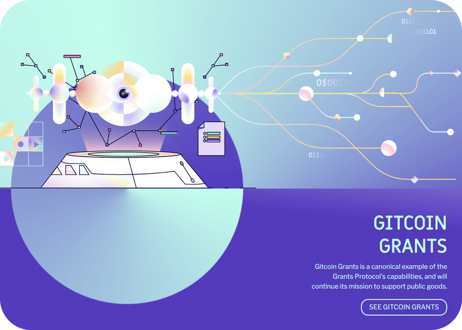
For example, our current homepage banner uses legacy Gitcoin brand colors with a new illustration style. Artwork by Biux.
When we started considering how developing our protocols might impact our brand language, contributors openly asked questions in a community workshop:
Where does the humanistic element - the focus on the natural world - come into play?
What about human collaboration?
How important is it that these are included in the visual identity?
What role does creativity play when it comes to forward thinking?
Do we need to be direct about this?
Months later, the questions are still resonating with us. This process of inquiry & community input led us to develop a unique vision: BIOMEMETIC MAGIC.
Biomemetic Magic
Biomemetic magic is our semantic vision of Gitcoin’s heartbeat, and more specifically the values we uphold as we build, coordinate, communicate, and use quadratic funding tools to expand and share as a network. Words are spells, and the underlying concepts defined below leverage our unique potential to create, fund, and share in service to the communities and cultures who would benefit from mutuality.
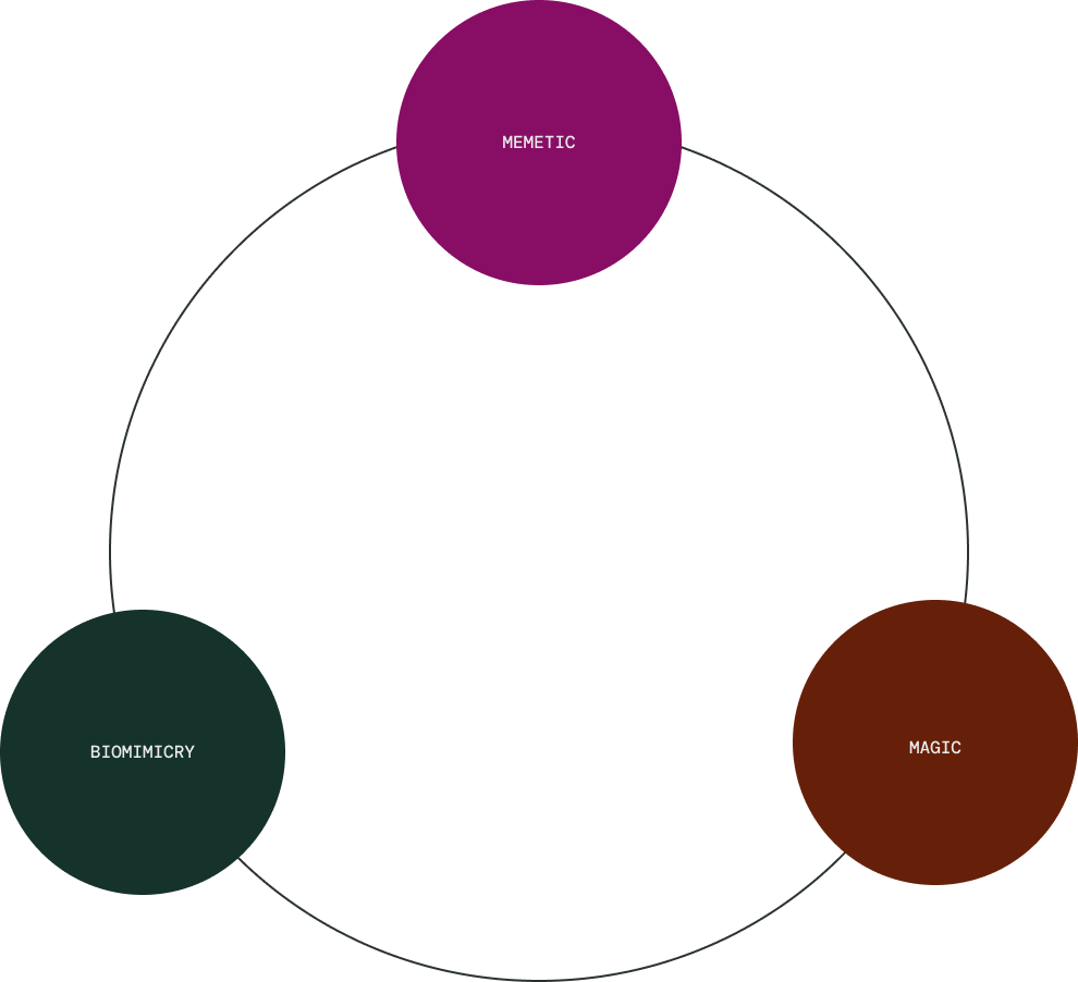
Biomimicry is designing and building tools and structures that are based on organic materials and processes.
Memetic is the study of information and culture.
Magic is influencing ordinary life through acts of intention.
Conceptual Linguistics
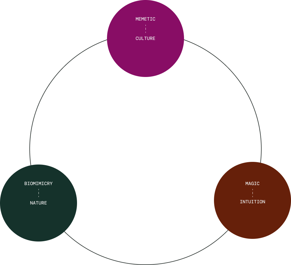
Biomimicry can be seen interchangeably with nature - our source of inspiration for building structures, protocols, networks, and communities.
Memetic can be distilled to the word culture, in reference to our presence and contributions to the web3 community as well as our burgeoning audience.
Magic can be understood as intuition. In practice, intuition translates to clarity of intention, the ability to read the energy of the market, encouraging ourselves and fellow buidlrs to confidently step into the unknowable future, practice steps of trust, and build with patience.
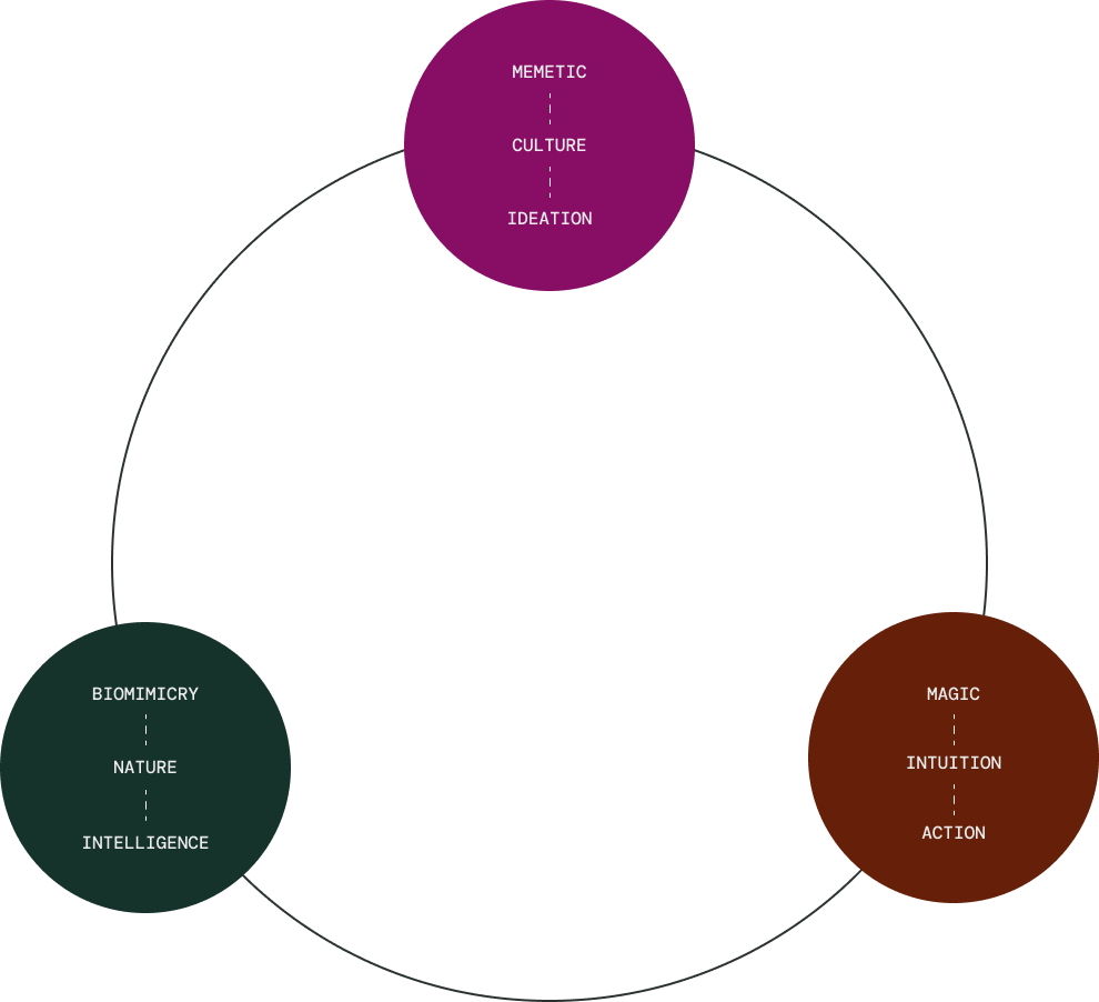
Biomimicry and nature can be read as intelligence, the invisible grid underlying our networks and protocols.
Memetic and culture can be refined further as ideation. Ideation is a constant source of energy – both inside the DAO and the web3 community. Our ability to constantly improve our products, protocols, strategies, and yes, memes - is a rational map for future work.
Magic and intuition lead to action. In this context, action is any progress made toward a shared goal and desired outcome. Applied thought, reason, logic, science, and math all converge through magic.
Applied Concepts
You might be wondering, “How does this become something?” While we co-create definitions for how to develop biomemetic magic across product and content marketing, here is a window into our visual design system.
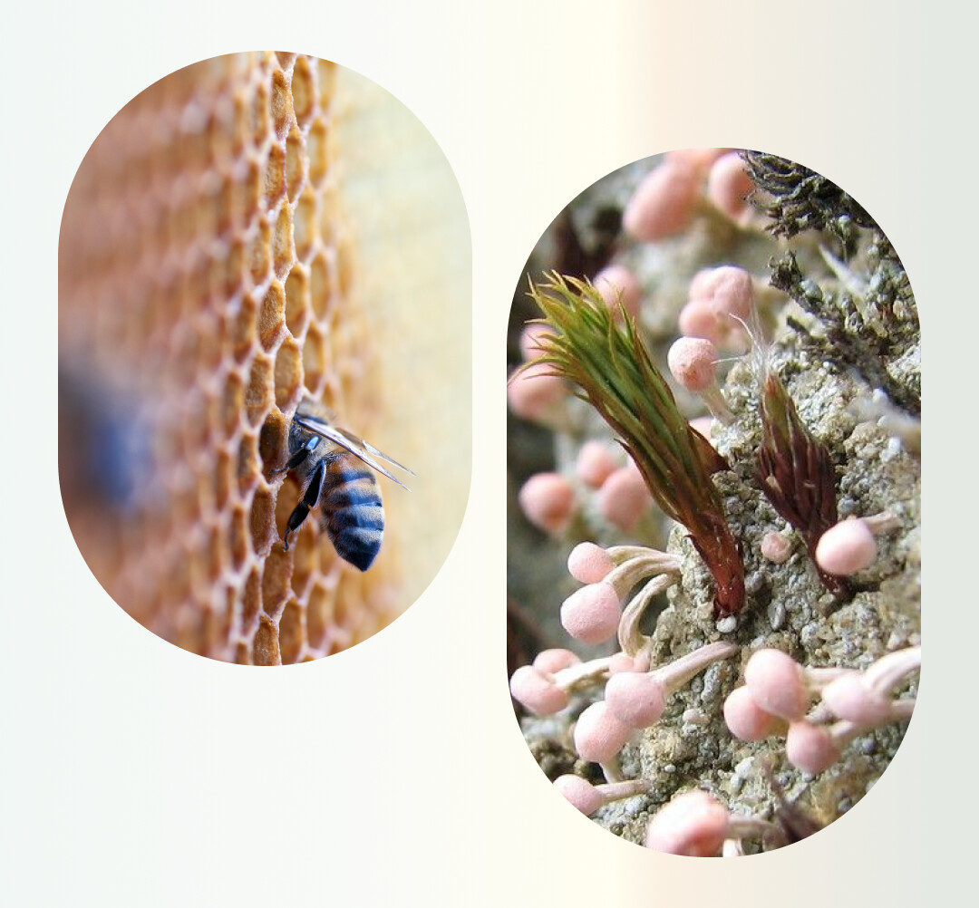
Introducing Lichenpunk
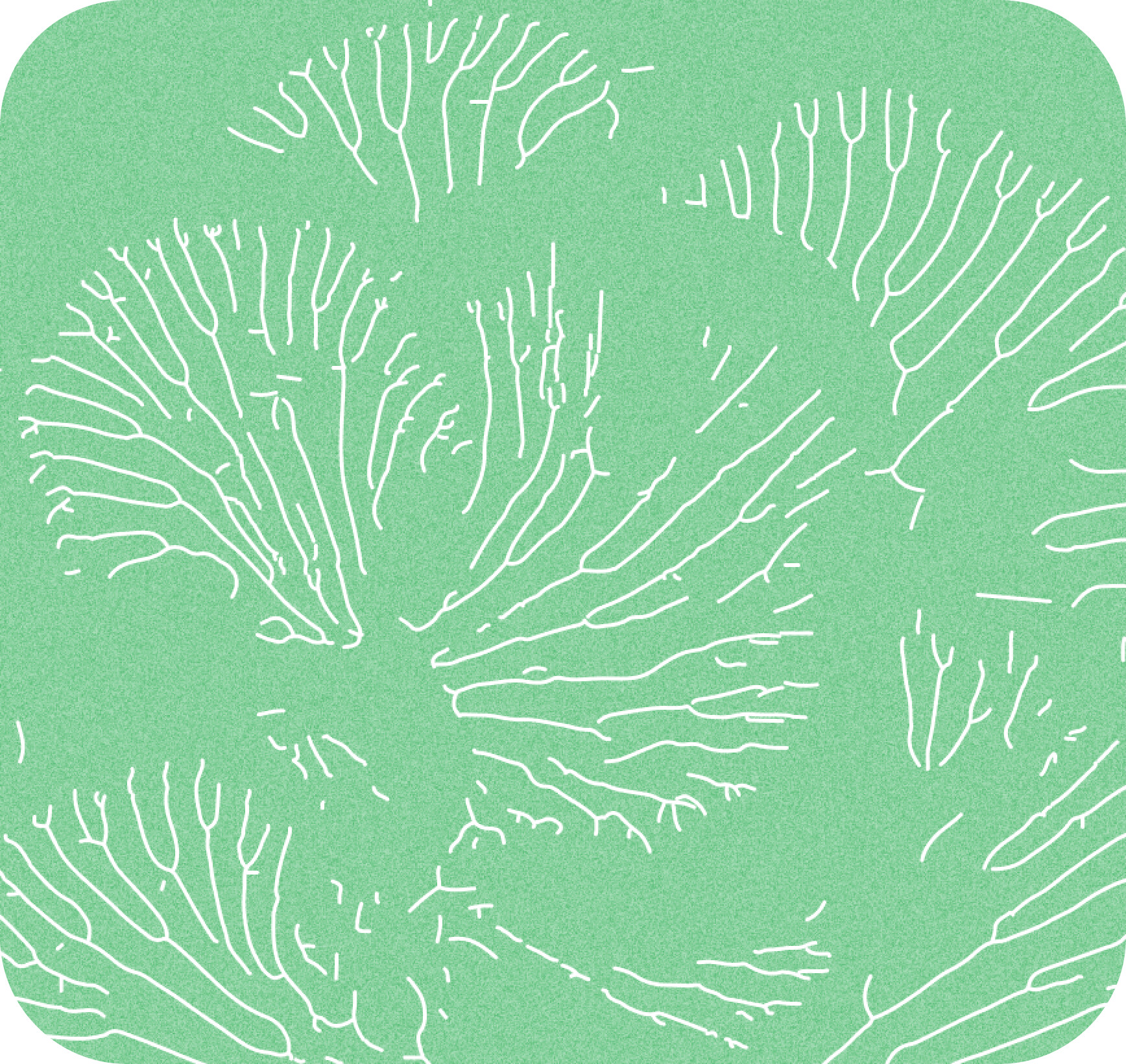
Artwork by Harry
Lichenpunk is an expression of Gitcoin’s niche presence, and the biomimicry aspect of biomemetic magic. Lichenpunk is the rebelliousness of mutuality, the subtle and humble networks of relationships that allow our network to flourish.
Lichenpunk is our adaptive response to solarpunk and lunarpunk. It’s a little more granular and specific to our networks, protocols, and community expression.
While solarpunk aligns with our regen vibes, we’re expanding through the scope of that movement. For lunarpunk, Gitcoin isn’t necessarily pessimistic about blockchain security and bad actors. We just care about and plan for privacy/security protections proactively. We can be protective without being fearful. We can believe in a positive future while working through the practical hurdles to get there.
Lichenpunk draws a figurative circle around all of that.
Next steps
Lunarpunk and solarpunk definitely have a place in our brand system. We’ll cover that and more in our next post, especially with how brand applies to our growing product suite.
For now, I’m happy to hear thoughts and questions! Make your voice heard in the comments, and help support the brand evolution in the process. <3