Gitcoin Visual Language
This is the second in a new series on Gitcoin’s evolving brand strategy. Our visual brand identity is evolving as part of a larger reflection of our transition from an Impact DAO to a Protocol DAO, which we’re announcing at ETHDenver.
Process
As a values-led design team, we’ve been working to mindfully create concepts and ideas that are meaningful. This work is rooted in our Brand Values, and evolved in parallel with the brand strategy. For a refresh on the preceding work, watch our December Community Call and follow along with our presentation.
Outcome
Our design team has been hard at work producing visual assets and ideas to support the brand strategy that many of you contributed to and led by Alexa. The design work being shared today is one part of this larger brand evolution process. The work is designed to shine a light on the larger function of Gitcoin, as well as reflect light on you as a contributor or community member.
Biomemetic Magic → Lichenpunk
If you read my last post then you’re aware of our visual brand concept, Biomemetic Magic. The TLDR is that an endless loop of creation, ideation, and feedback is the underlying design ethos:

We’re visioning a world through our protocols and programs with shared values that guide the way we build, coordinate, communicate, and use quadratic funding tools to expand and share as a network. When you consider the trust, structure, and interdependence required for us to build, it’s pretty incredible.
All of this meta strategy and philosophy starts translating to design elements through the doorways and modes of expression explored below.
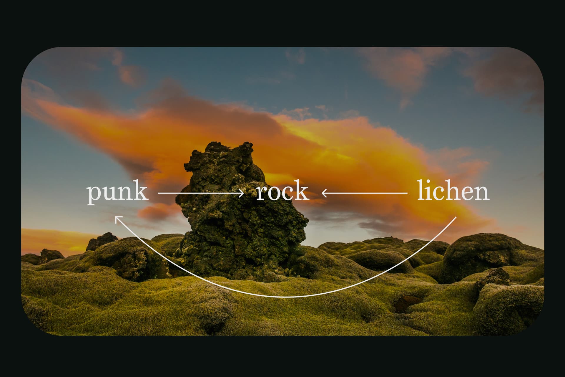
Lichenpunk
There are many ways to draw metaphors about the Gitcoin ecosystem. Our team is inspired by the symbiotic relationship among lichen, mycelium and algae. Lichen are a strong example of multi-species symbiosis, essentially acting as a bridge for fungi to receive nutrients. They’re also a living, changing organism that is equally powerful and humble – strong without asserting dominance.

Lichen deliver nutrients to mushroom networks so they can thrive and grow. Their mycelial lives grow largely beneath the soil, forming the underground channels that trees use to communicate with each other.
The symbiosis of lichen and fungi networks, and the benefit to trees, is similar to the way Gitcoin acts as a bridge among our communities, our protocols, and the ecosystems where we offer sustainability and growth.
Lichenpunk is an expression of the rebellious nature of mutuality.
Harmony is achieved through coordination.
Introducing Dawnpunk
Dawnpunk is the “gm” of our visuals. It’s a resting place where builders, coordinators, and funders can meditate, share innovation, and find cryptographic creativity. Space and spaciousness are the keys to unlocking our creative source.

Dawnpunk highlights the memetic and magical aspects of our brand. The liminal edges of space and time converge in our brand expression through dawnpunk. Dawnpunk is an essence – a space between lunarpunk and solarpunk.
Where solarpunk is the brightest point in the day, and lunarpunk is in the inky black of night, dawnpunk is a calm moment of focus between the two. Dawnpunk as a design theme is intended for special occasion use only, such as events or partnerships with collaborators (like Metalabel.)
Dawnpunk is a state of mind, a slow and steady drumbeat, an echoing sound of tranquility.
Solarpunk
Solarpunk is a throughline to our legacy visuals.

Gitcoin shares the values and perspective of the solarpunk movement in many aspects of our culture and community: a world focused on sustainability, harmony, and solving contemporary coordination challenges.
We’re looking at adapting solarpunk for Allo Protocol - details to come!
Lunarpunk
Lunarpunk is a touchstone between our brand history and future.

Lunarpunk is a visual perspective we’ve been embracing with the launch of Passport. Building tools and structures to guard against Sybils and protect the privacy of our network is a keystone in our future as a Protocol DAO.
Drawing on our darker palette for the early Passport launch in S15 opened us to a larger conversation about what it might be like to codify lunarpunk as part of our brand kit, design language, and UI systems.
Lunarpunk stays in our design language as a lens for Passport protocol, product and any future endeavors with a privacy or security focus.
Thank you
Please feel free to ask clarifying questions or leave feedback in the comments.
For a look into our team’s visual inspiration, check out our are.na board! There’s a communal vision board as well. If you’d like to contribute your own found sources of creative magic, just message me.
Our next post will be about COLOR.