Gitcoin Visual Language
This is the fourth topic in a new series on Gitcoin’s evolving brand strategy. Our visual brand identity is evolving as part of a larger reflection of our transition from an Impact DAO to a Protocol DAO, which we’re announcing at ETHDenver.
Process
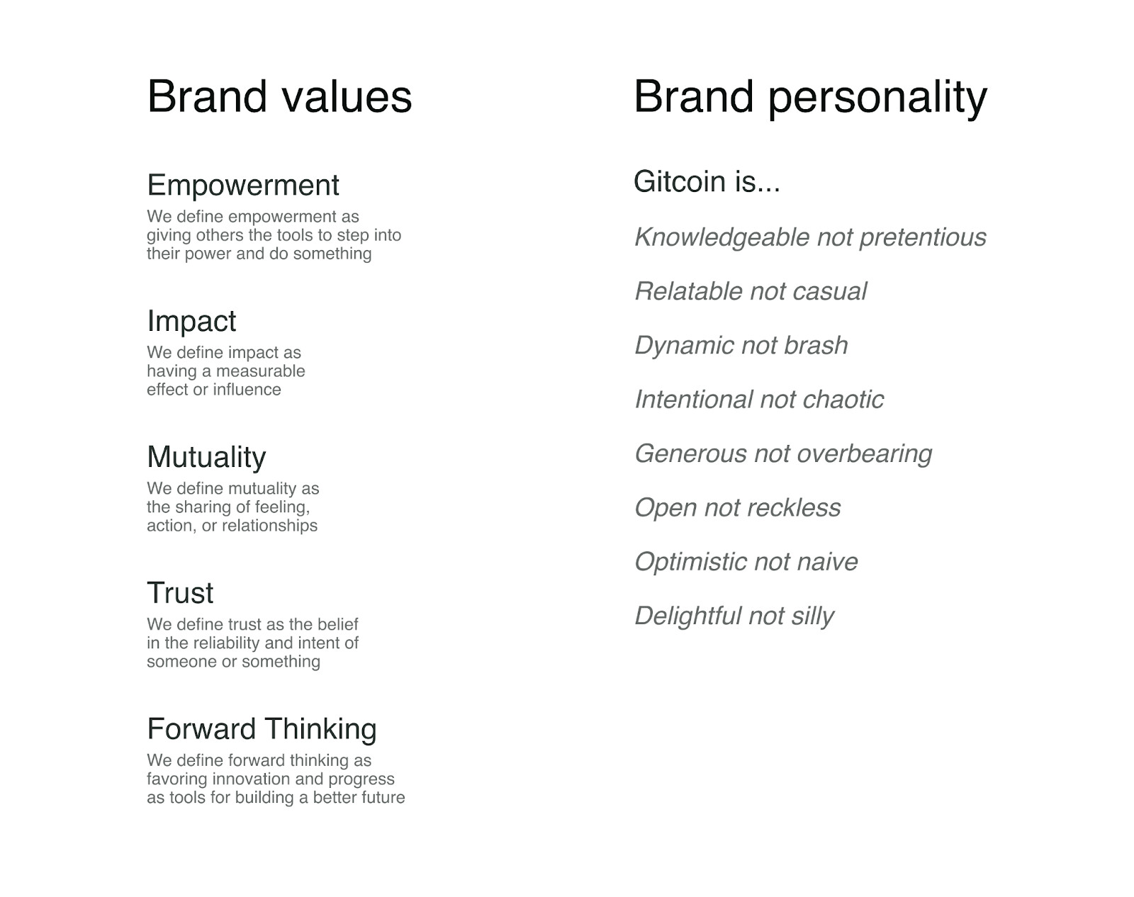
As a values-led design team, we’ve been working to mindfully create concepts and ideas that are meaningful. This work is rooted in our Brand Values, and evolved in parallel with the brand strategy. For a refresh on the preceding work, watch our December Community Call and [follow along with our presentation (Gitcoin Community Call Brand Takeover - Google Slides).
Outcome
Our design team has been producing visual assets and ideas to support the brand strategy that many of you contributed to and led by Alexa. The design work being shared today is one part of a brand evolution process. The work is designed to shine a light on the larger function of Gitcoin, as well as reflect light on you as a contributor or community member.
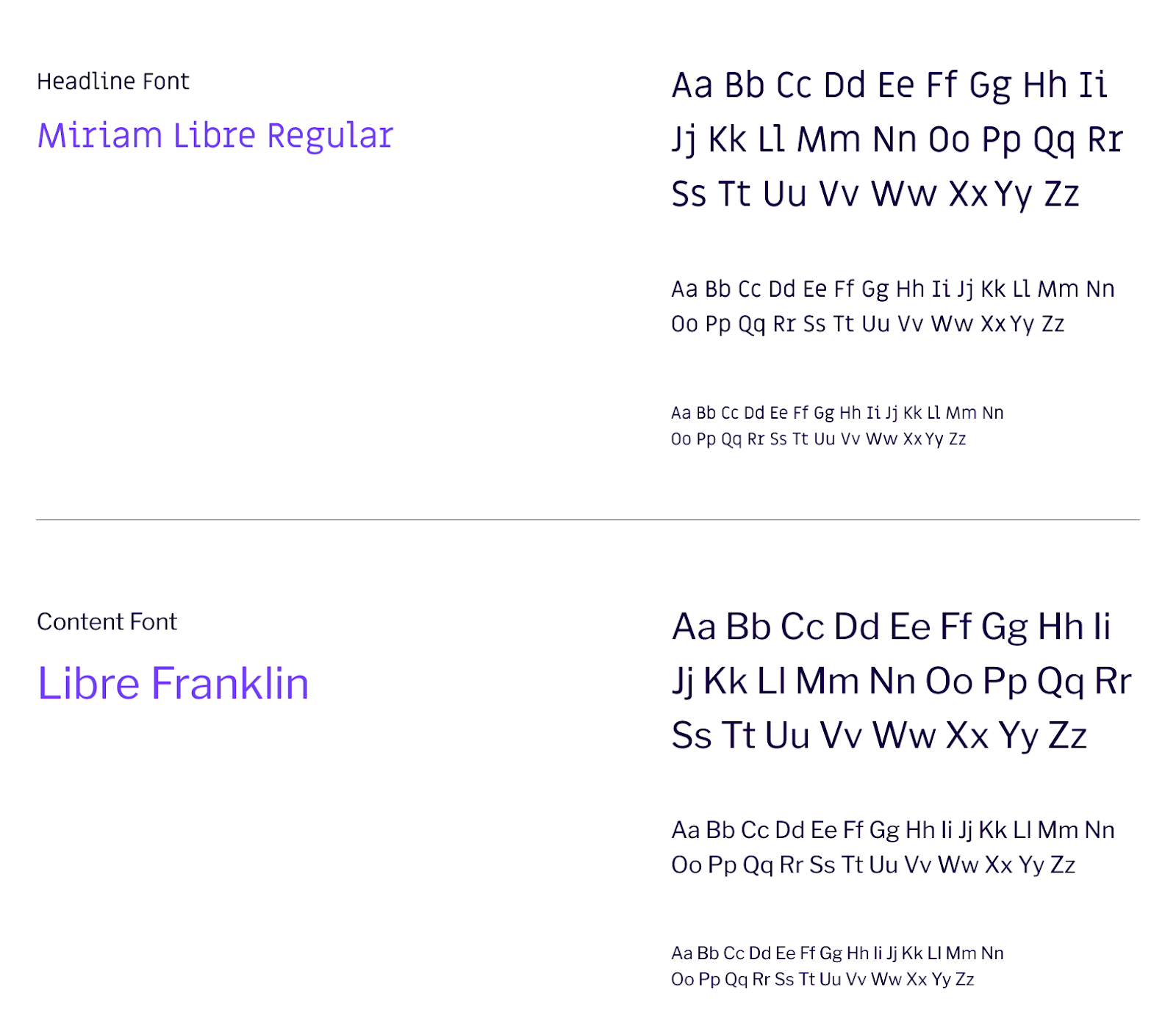
Gitcoin’s Type Stack
Gitcoin currently uses Miriam Libre for headlines and Libre Franklin as a content font. The type scales are well-designed (thanks, Octavian!)
Making Changes
Our brand design process started with an internal conversation and spirited debate about typography. Do we need to change the fonts? Yes. Could we change our brand without changing the fonts? Yes and…it’s not an ideal path. How would a font update cascade across the web and product pages? In a way that considers each surface as a system with shared universal components. What is that process going to be like? Coordinated across workstreams and woven into the S17 roadmap.
TLDR; We’re changing the fonts! The goal of our design system is to be functional, relevant, and endure the next 3-5 years (at least).
There is one guiding principle for our typography:
Choose authenticity first.
In practice, that means no trendy fonts and no hypermodern fluff.
Font Shift
I lead creative with intuition and trust. There’s a healthy tension in this style of working. Logic is the foundation of good design. Design that allows for risk-taking leads to great work. Surprises found in the discovery phase can point a designer to an entirely new and resonant direction.
Our small brand design team spent time exploring and culling type options in equal measure, then repeating that process until we found the most resonant fonts that align with our brand’s tone of voice, and meet all of our practical requirements of legibility and considered context.

Screenshot of our Figma archive file.
To help guide the work beyond personal preference, we consulted the brand strategy guardrails almost like an oracle. Does this font inspire trust? Is this font forward-thinking? Is the typeface open and friendly?
This image is posted in our design files the way a motivational poster would hang in a studio.
Choosing fonts
In the end, we chose one or two fonts that came into play early in the process. As we started stress testing the font pairings and found an early choice for paragraphs unsuitable for long term use, we rerouted to find a suitable alternative.
There are so many decisions and considerations that go into a font stack. If anyone wants to hear more on this topic or about our process to align on the choices, let me know and our team will be happy to share a new topic on type.
For now, let’s explore the new fonts of Gitcoin!
Type System

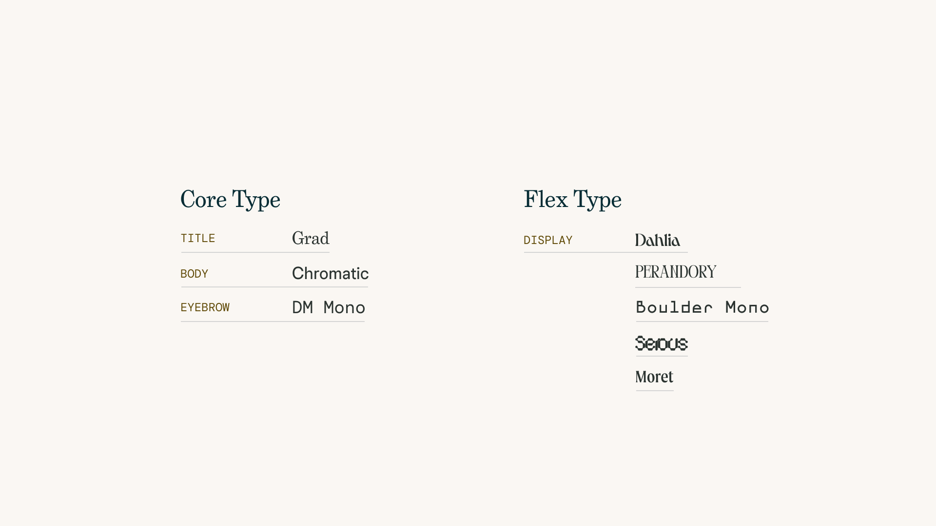
Our type system comprises two categories that support our visual language as a hybrid system that lives between a traditional set of rules and decentralized lines in the sand.
Core type is a set of boilerplate fonts that are friendly, functional, reliable, technical yet inclusive. The fonts selected for our core type stack are well-suited for a range of touchpoints, from print to product.
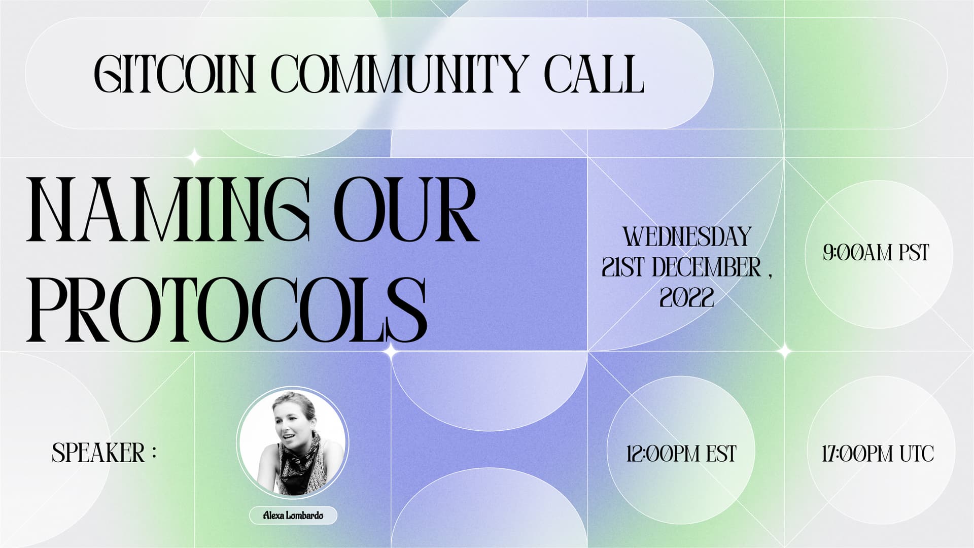
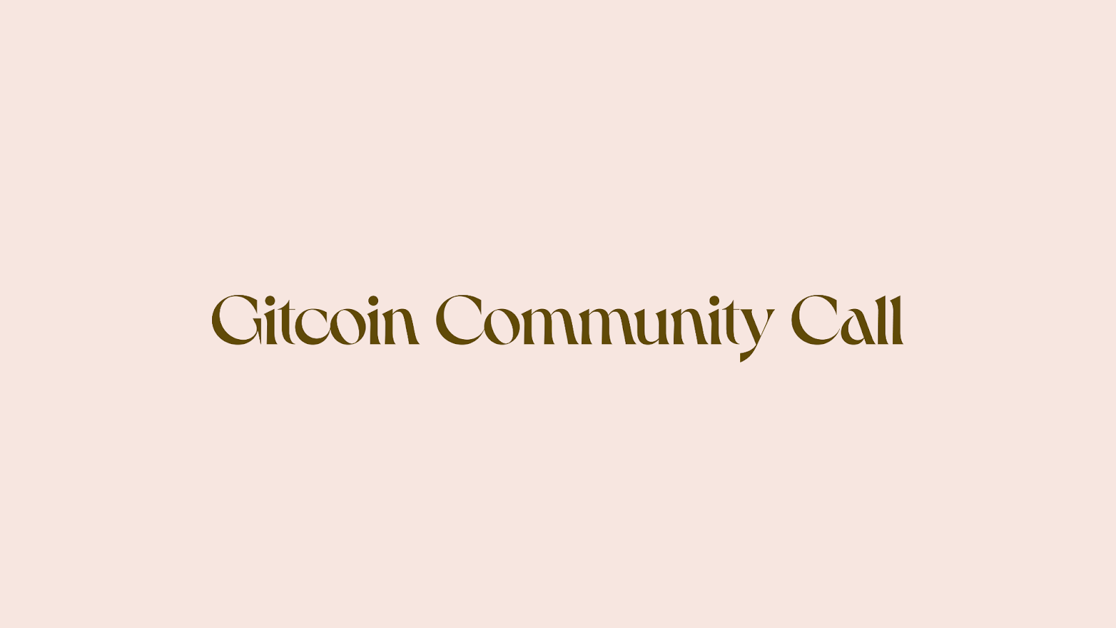
Flex type is a collection of display fonts that are experimental, abundantly joyful, thoughtful typefaces that stray from the norm and take risks. This type system is inspired by one of our designers, Biux, who is frequently bringing new and interesting typography into the mix of her work.
Our Gitcoin Community Call banners are a solid example of how Biux’s work inspired an emerging permissionless playground of typographic expression.
Core Type
Our core fonts were chosen for their ability to play well together as a type stack. Their forms and designs are naturally compatible.

Grad
Grad is a smart, friendly, warm, inviting font that says “Welcome to Gitcoin! Come explore pluralism in the Quadratic Lands.”
Like Gitcoin, the typeface Grad has undergone its own transformations. Originally designed as a bitmap font by Phil Martin in the early 90s, it was completely reworked as a digital Opentype font in 2004 by Mark Simonson.
Chromatic
Chromatic is described by its designing foundry, Colophon, as being an “anti-genre” font. It spans many regions of styles, each with its own expression of the core font personality. We’re drawn to the Grotesk version of this font, and think it works quite well in pairing with Grad. Since our use cases for typography are as broad as the font styles available, we believe Chromatic is a font that can grow with our needs over time. For now, we’ve chosen a versatile weight from a deceptively complex font.

Kudos to Harry for introducing Chromatic to our type system.
DM Mono
DM Mono is an open source, monospace font from an extensive family designed by Colophon Foundry. It is reliable and well suited for clarity, brevity, and precision.

Flex Type
Dahlia
Dahlia is a romantic serif designed by an independent type foundry in Paris, Violaine & Jérémy. After working through the idea of flex type, we decided to ship Dahlia and bring one weight of this lovely font into our brand. Dahlia is a team favorite, primed to be mixed with our core type in headings or expressive type designs.
Serous
Serous is a geometric typeface by Formist Foundry, designed to “embody the feeling of liquid.” Serous is available in four weights and best used with a strong eye for typography. Its place in our flex type stack is special occasion use, such as partnerships, print materials, or limited edition merch.
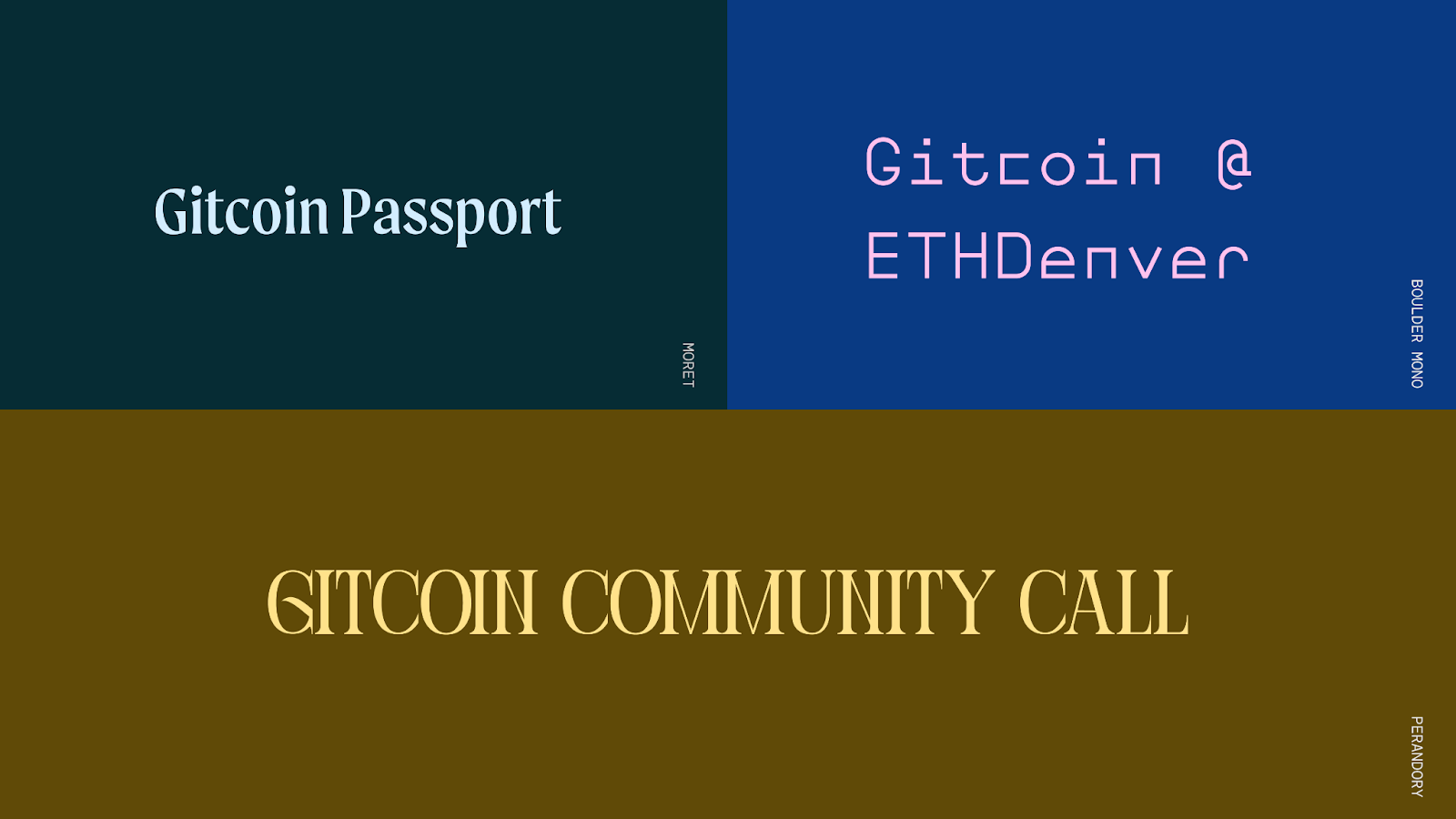
Moret, Boulder & Perandory
As I wrote earlier, Perandory is our current font for community event flyers. Moret may find a home in one of our protocols as we extend the core brand in February. Boulder Mono is an intriguing option for sample graphics where we may want to call attention to an event, such as our presence at ETHDenver.
Thank you
Please ask clarifying questions or leave feedback in the comments!
Pro tip: When giving feedback, aim to be as objective as possible. Explore where your thinking originates. Does your point of view connect to the brand strategy? Is your perspective connected to our values? How so?
Our next post will be about LOGOS.