Gitcoin Visual Language
This is the third topic in a new series on Gitcoin’s evolving brand strategy. Our visual brand identity is evolving as part of a larger reflection of our transition from an Impact DAO to a Protocol DAO, which we’re announcing at ETHDenver.
Process
As a values-led design team, we’ve been working to mindfully create concepts and ideas that are meaningful. This work is rooted in our Brand Values, and evolved in parallel with the brand strategy. For a refresh on the preceding work, watch our December Community Call and follow along with our presentation.
Outcome
Our design team has been hard at work producing visual assets and ideas to support the brand strategy that many of you contributed to and led by Alexa. The design work being shared today is one part of this larger brand evolution process. The work is designed to shine a light on the larger function of Gitcoin, as well as reflect light on you as a contributor or community member.
My belief is that decentralized design systems are a living, breathing public good. Sharing our visual brand design progress publicly is a milestone in translating the work from design files to the broader community. The purpose is to illuminate our team’s work, inspire your own, spark questions, and open a channel for our design team to connect with you, our community and peers.
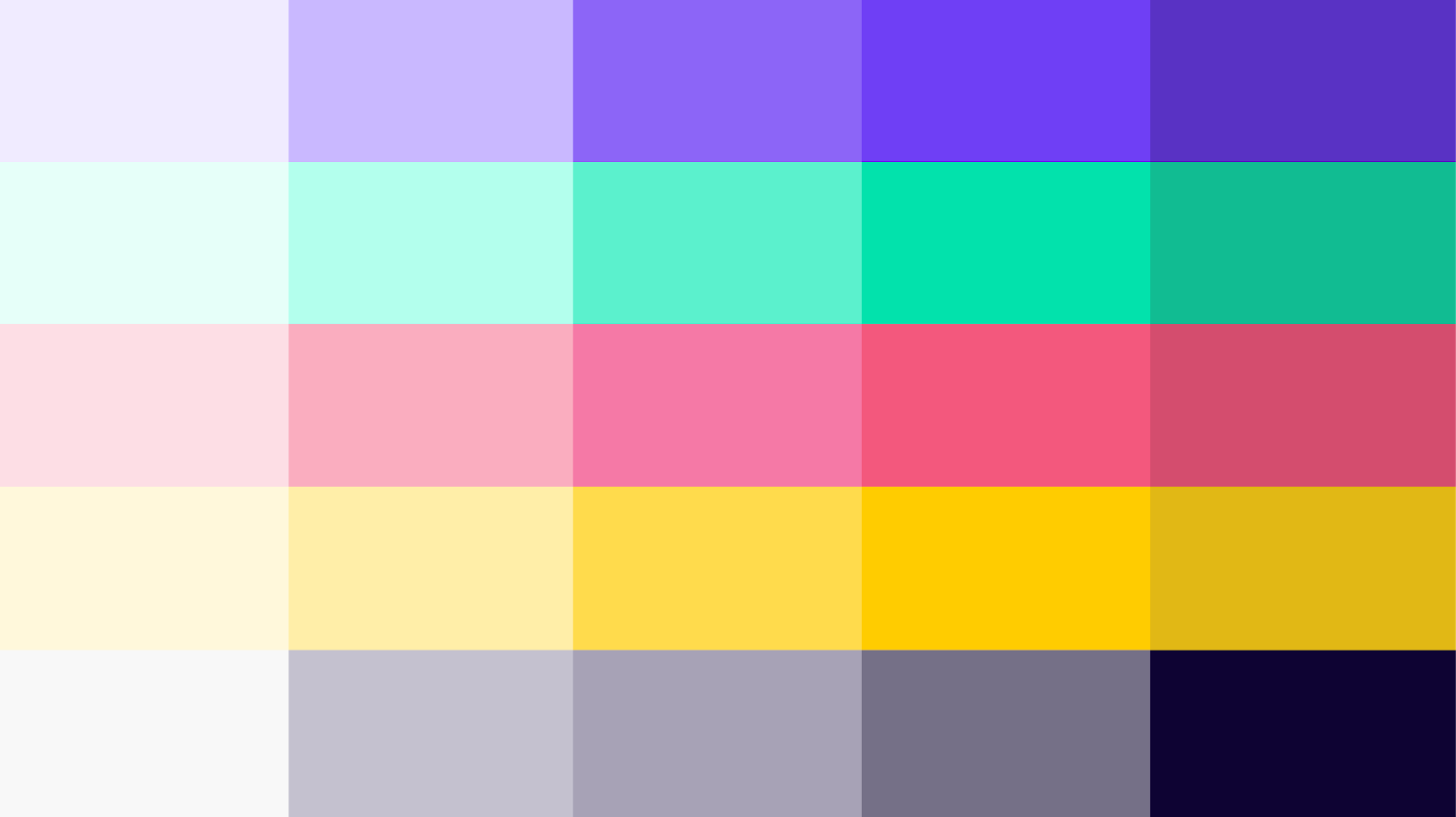
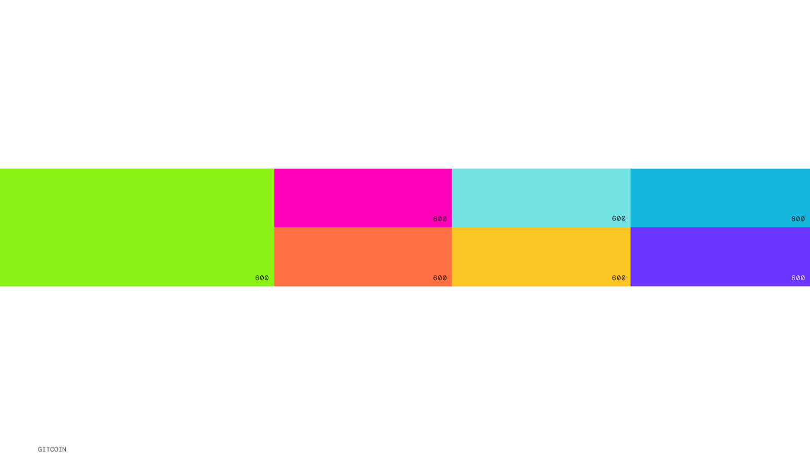
Gitcoin’s Color History
When Gitcoin was transitioning from a company to a DAO, our creative department was a truly permissionless place. Every design asset was created through bounties, which is how Octavian joined the workstream. He organized all the designs and artwork flying around into a truly considered design system, giving a sense of clarity and purpose to the identity work.
The original brand colors are a balanced range of bright, mellow, cool, warm and neutral tones:
Color Evolution
Our evolving color palette reflects our current brand strategy, while also considering the growing needs and considerations of our sub-brands and products. The color strategy I’m sharing below is a work in progress that our designers are refining. Our design system is scheduled to be complete on Friday, February 03. In February, MMM and GPC designers are planning to design together to adopt and adapt the evolving brand design system.
Change is imperative for cultivating growth and delivering the best possible experiences for the people who interact with Gitcoin. We’re creating a shared visual language to welcome people to our ecosystem, whether our audience is developers, program managers, new-to-crypto regens, or potential grants round collaborators hoping to learn more about us.
Reviewing Design
When looking at work in progress, I find it can be helpful to reference our brand personality guardrails:
Gitcoin is…
Knowledgeable not pretentious
Relatable not casual
Dynamic not brash
Intentional not chaotic
Generous not overbearing
Open not reckless
Optimistic not naive
Delightful not silly
Color Pillars
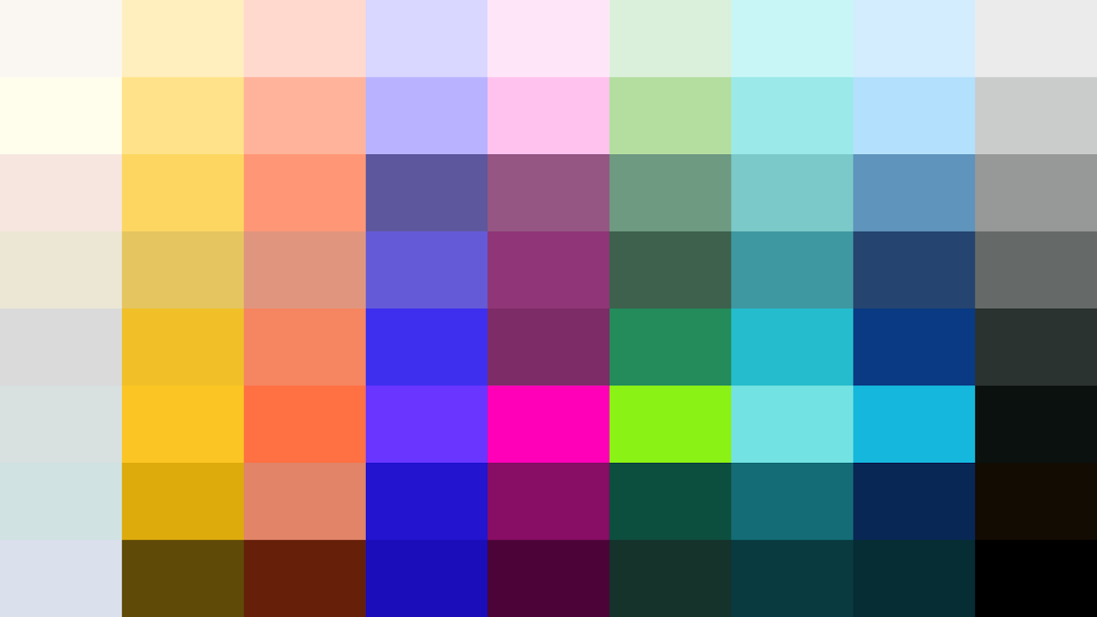
Our color pillars are designed to support a range of visual expression within the DAO – illustrations, social materials, product design, merch, print, and any unknown future needs. Color pillars are the individual color families outlined in this graphic. Every color pillar serves a purpose – the colors that are connected to our original brand are clearly detailed below.
Color System
Our color system is organized by color pillars, color families, and color expression. Color pillars are the individual colors outlined above.
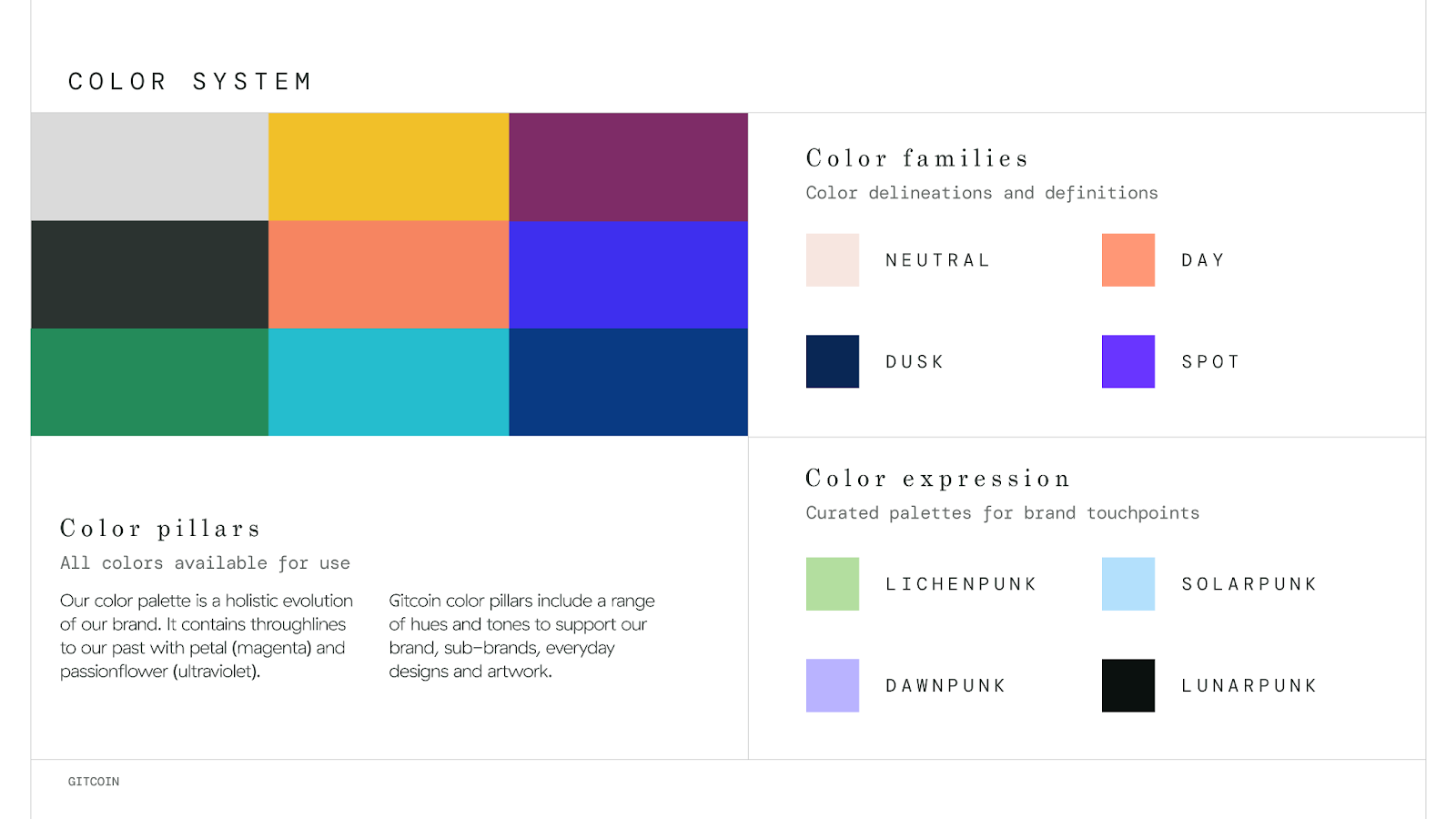
Color families
Our color families are Neutral, Day, Dusk, and Spot. The purpose of color families is to provide clarity on how to approach a broad color palette. Designers can make thoughtful choices, organize color palettes based on use cases, and map decisions to how any color appears in our system.
Neutral
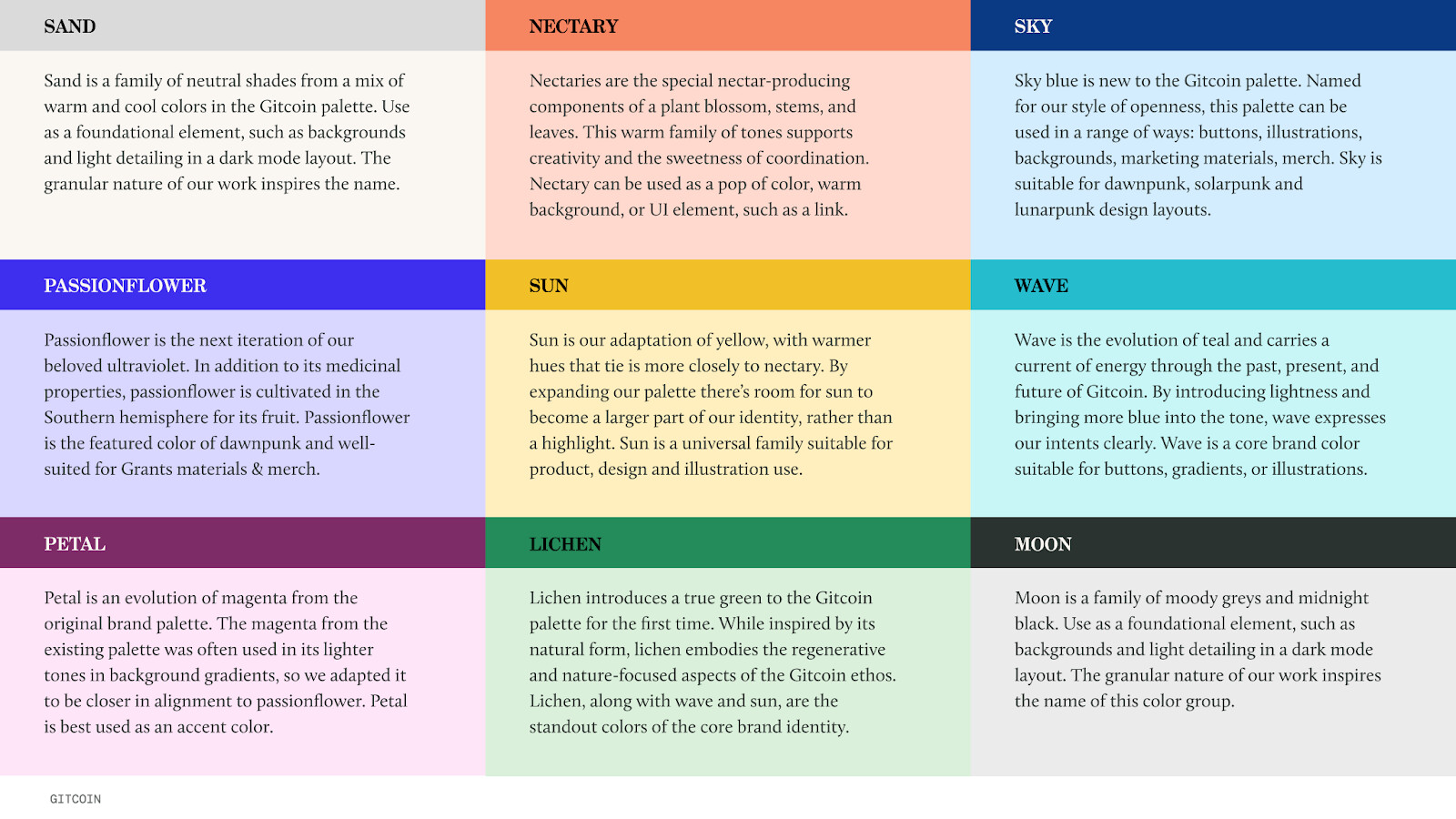
The Neutral palette comprises the Sand and Moon pillars. Essentially our lightest, softest tones and our deepest, richest greys make up the entirety of the Neutral palette. You can use these colors every day to establish a baseline or foundation for your work.
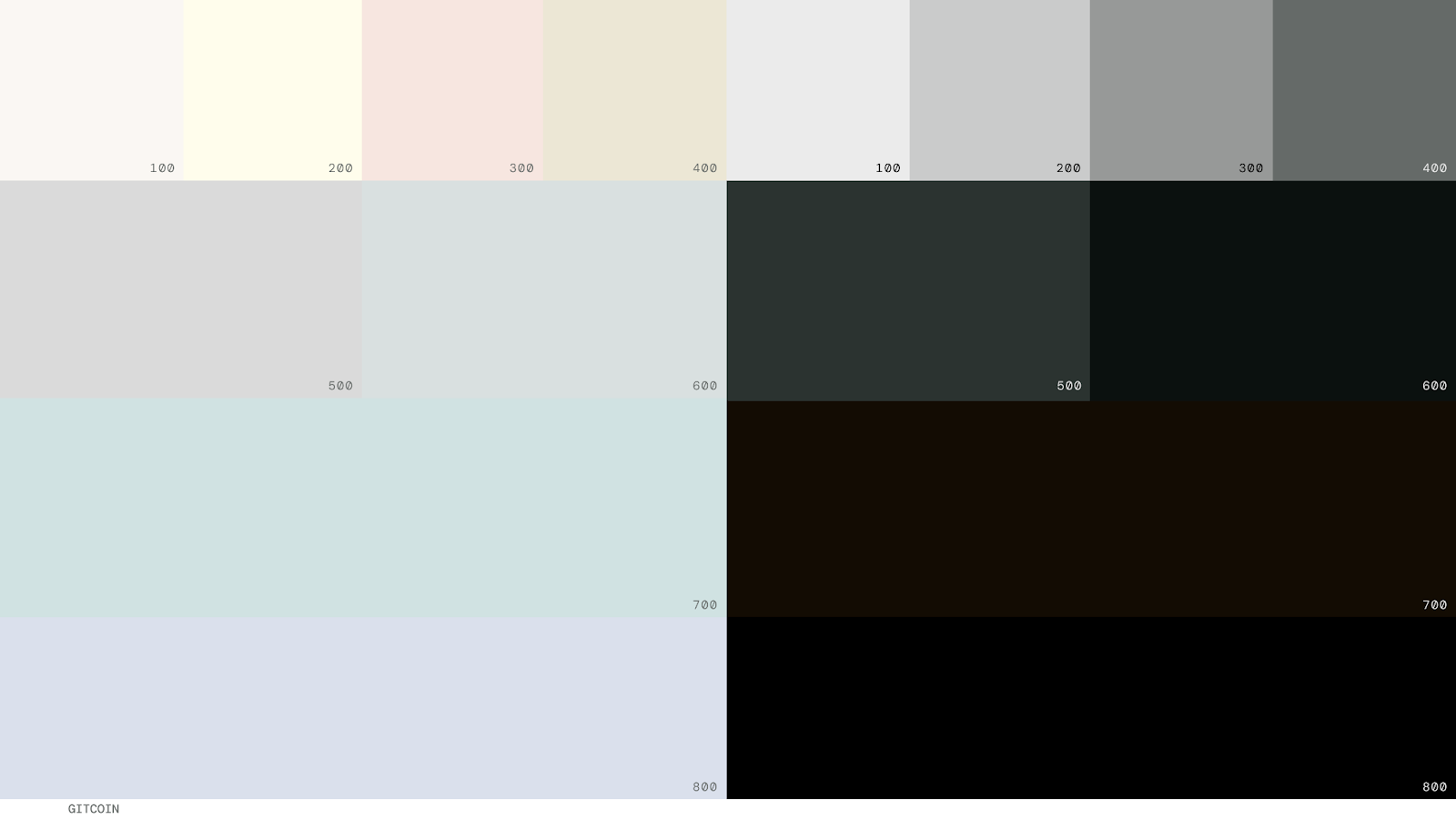
There’s a new opportunity to bring a more grounded tone to our design work. Drawing colors from the Neutral palette might encourage a subtle tone shift that conveys confidence, whether it’s a presentation about protocol functionality or the web colors we choose for developer documentation.
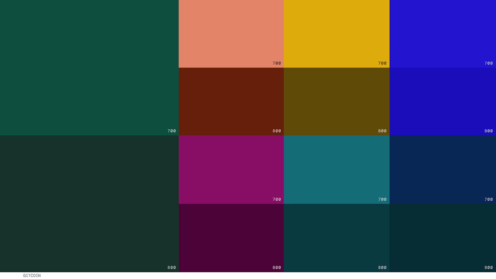
Dusk
Dusk mode is for day to day use as our own dark side of the moss. The Dusk palette refers to the 700 and 800 shades of Lichen, Petal, Sun, Nectary, Wave, Sky, and Passionflower.
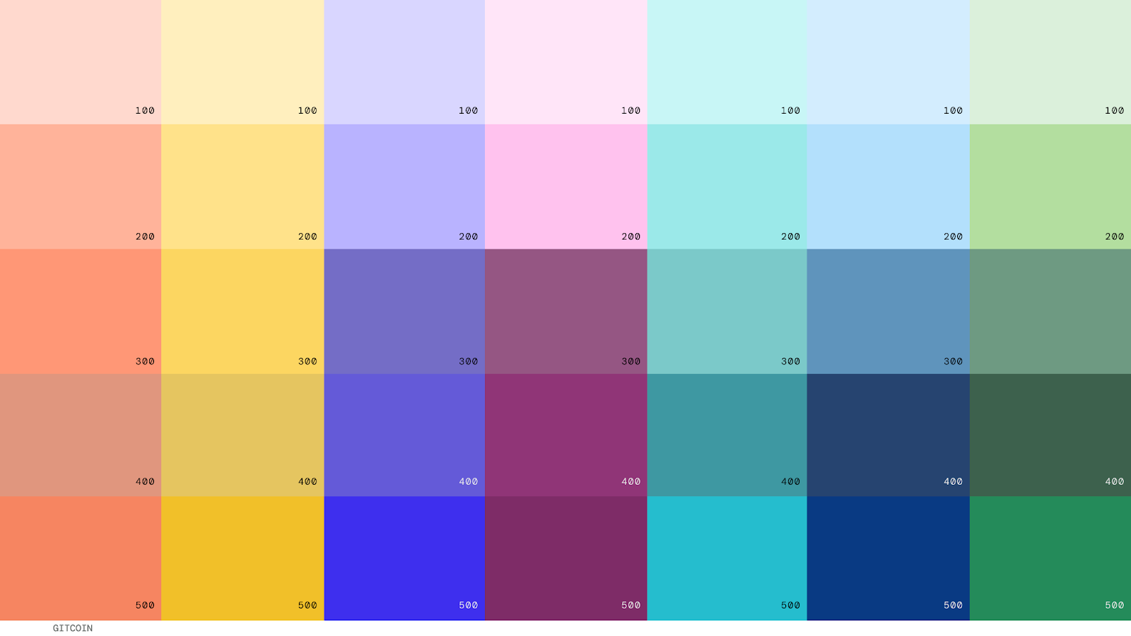
Day
The day palette is core to our everyday colors. When you’re designing an uplifting image or graphic, this is where to start. Our optimistic hues can brighten up any design or illustration. The Day palette is the range of light to mid tones of the Nectary, Sun, Passionflower, Petal, Wave, Sky & Lichen families.
Spot colors
Spot colors are designed to be used sparingly for a pop of color, special merch designs, or an eccentric meme. Spot colors are for moments of intention, when you want to call attention to an action, or when you want to imbue a design with a jolt of energy. Spot colors are the 600 tones of the Lichen, Petal, Wave, Sky, Nectary, Sun & Passionflower families.
Color expression
The color palettes are in creative development.
Our team is working to solidify our choices and make thoughtful conjectures that benefit the brand, design, product and dev functions in the present moment and with an eye on the future. This is truly in process, so you’re getting a window into our virtual studio. Your perspective in the comments would be considered, and your thoughts are welcome.
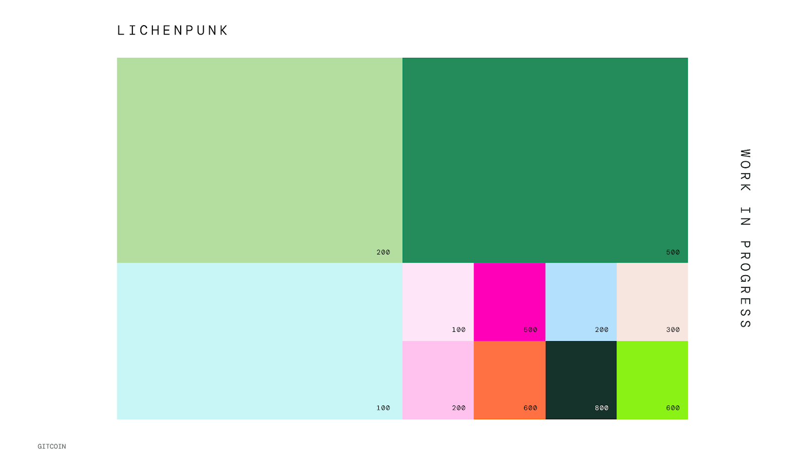
Lichenpunk
Lichenpunk is our core design palette for the flagship Gitcoin brand. Our team lifts from lichenpunk to communicate a sense of mutuality in our work, from design to illustrations to motion graphics.
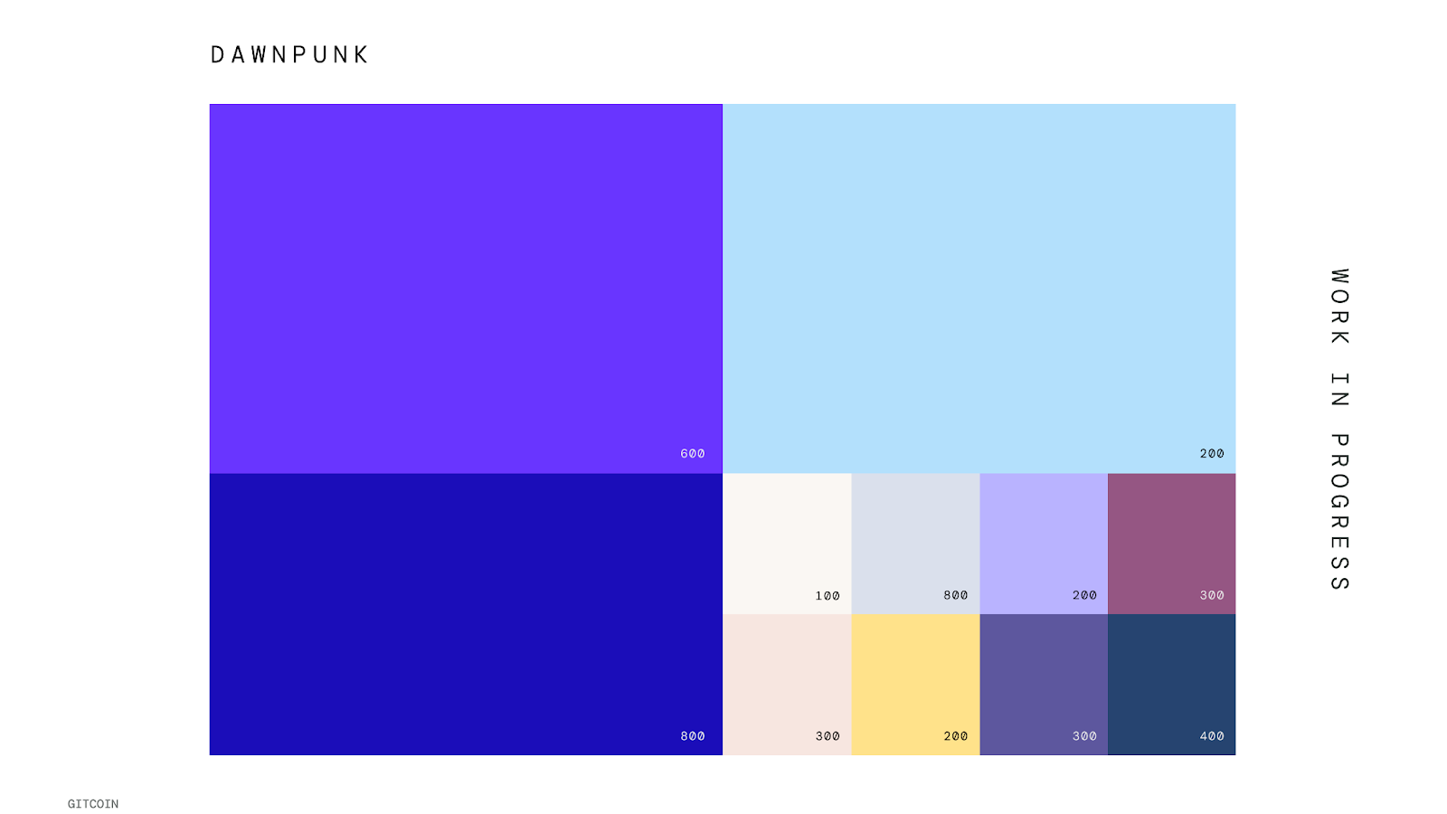
Dawnpunk
Dawnpunk is a palette intended for special use only. Think occasional microsite experiences, limited-edition merch, or unique partnership expressions like Metalabel.
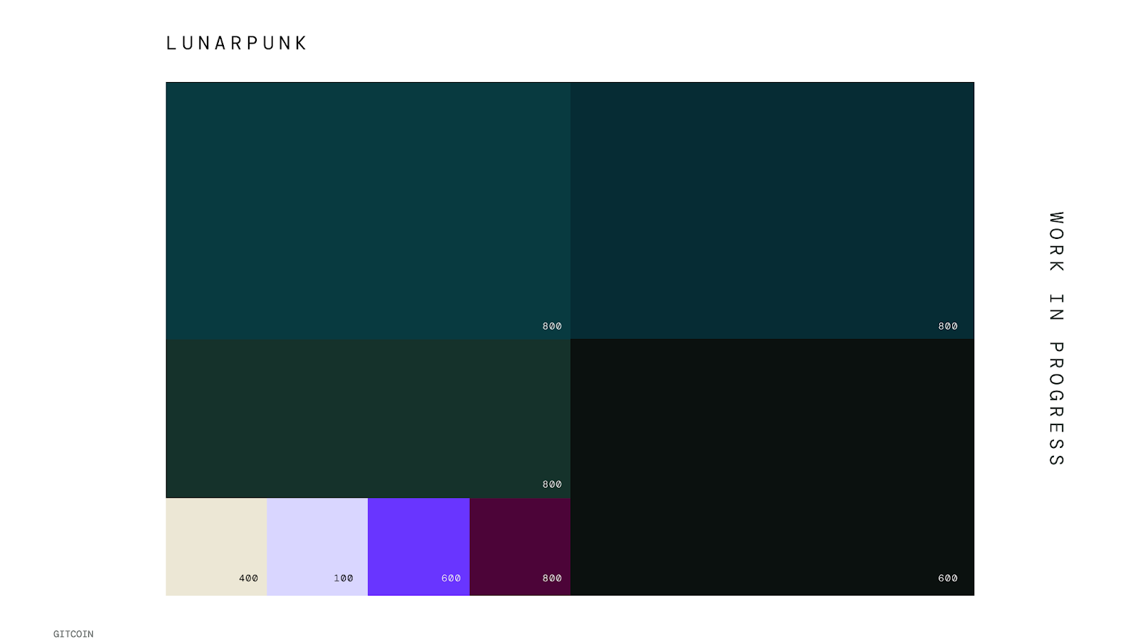
Lunarpunk
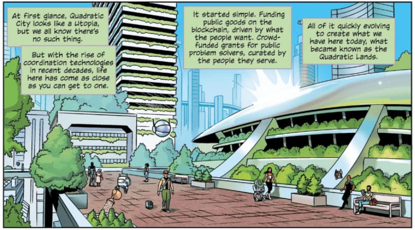
Lunarpunk is intended for products, protocols, experiences, and sub-brands that are connected to the lunarpunk ethos of security and privacy. Gitcoin Passport visuals to launch were created with this in mind, and the brand expresses a more serious tone through a darker palette.
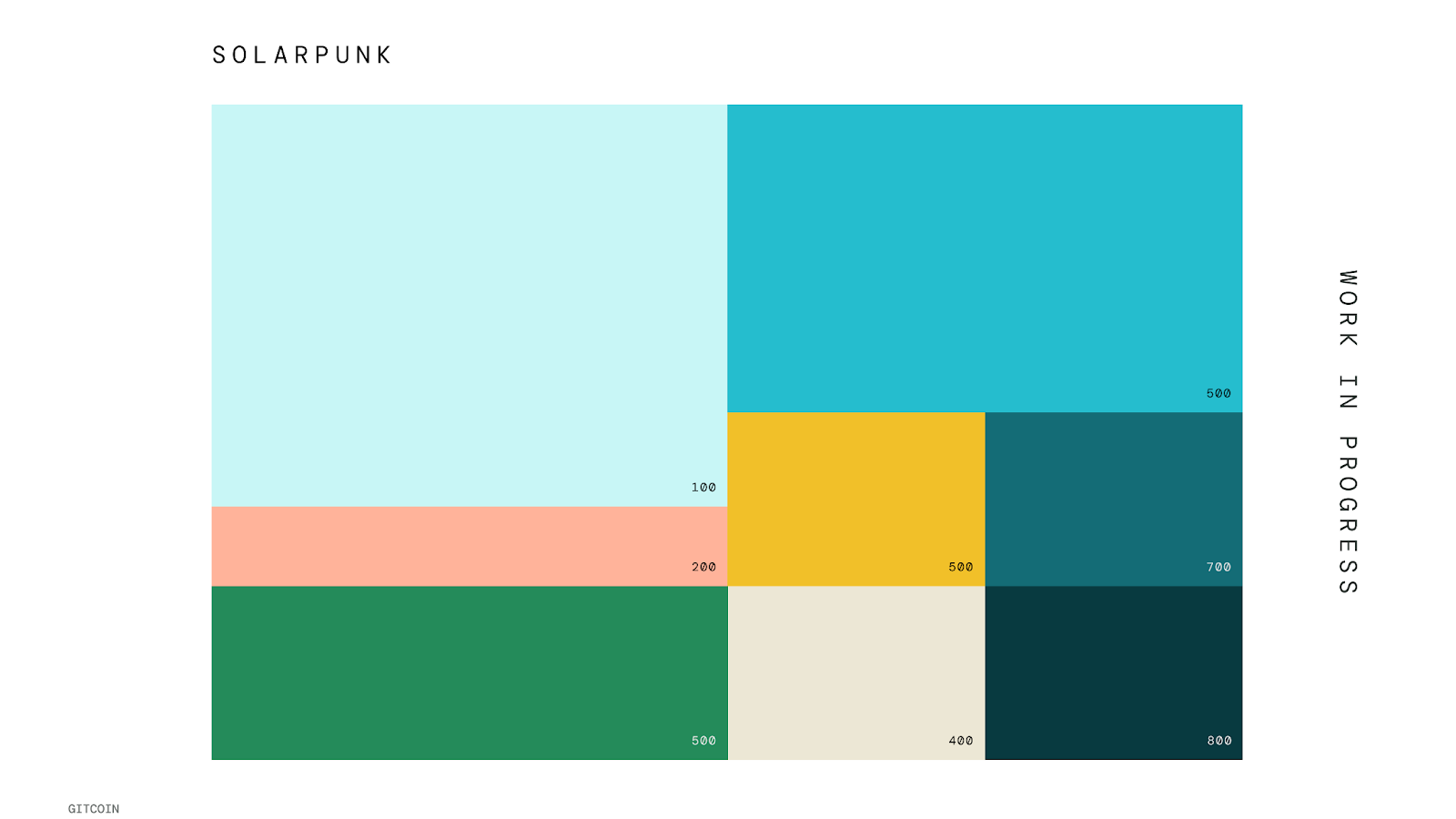
Solarpunk
Solarpunk is a legacy ethos that creates a bridge between Gitcoin yesterday and today. As a guidepost, we use solarpunk to communicate regen vibes. Solarpunk is well-positioned to be the flagship colorway for Allo Protocol.
Our Approach to Decentralized Color Design
Since Gitcoin is naturally evolving with a wide range of visual design touchpoints, we’re adapting our approach to color. Examples of visual design touchpoints are products, websites, protocol marketing, social posts, videos, events, merch and more.
Our biomemetic color palette reflects the diversity of our brand expression, and the biodiversity of the natural elements we’re drawing inspiration from. The range of colors allows us to flex and apply expressions to sub-brands and various product needs that gives them a unique look and feel while staying tethered to the Gitcoin core brand.
Our colors exist in the liminal space between modularity and autonomy. Stay close to the color values, and reinterpret the color families as needed. Aligning with the unique color values allows our brand to stay cohesive with plenty of room for creative, strategic expression.
Composability
Our palettes are designed to be composable. While our color families include logic and a framework for color groupings, every color is designed to be paired together. There are no wrong answers, with key exceptions for accessibility that we’re annotating as we complete our design system.
Part of working in a decentralized brand is making choices about how design elements go together. The design system we’re creating intends to remove obstacles and guesswork while providing room for expression and exploration. Our palette organization is intended as a launchpad for your creations with guardrails to support cohesion.
Thank you
Please feel free to ask clarifying questions or leave feedback in the comments!
Helpful tip: When giving feedback, aim to be as objective as possible. Explore where your thinking originates. Does your point of view connect to the brand strategy? Is your perspective connected to our values? How so?
Our next post will be about TYPOGRAPHY.