TL;DR
- Refined brand elements to further drive tech-centered future
- Inspiration from Gitcoin’s legacy graphics & illustrations
- Simpler, bolder, more consistency, more intention
- Easier to use, adapt, remix and collaborate on
Hey all,
I’m excited to walk you through the latest updates we’re rolling out for the Gitcoin brand. The updates are intended to both better reflect where Gitcoin currently stands as well as provide a foundation for us to grow and evolve over the next 1-2 years. You may have noticed some of these updates already across our website and other channels as we’ve been testing and experimenting with new styles and formats.
Before we jump into the updates, it’s worth noting how much we’ve grown since launching our last round of updates to the Gitcoin brand in early 2023, transitioning from program-focussed to protocol/product focussed. In that time we’ve launched three products (and subsequently three identities) in Grants Stack, Passport and Allo. The changes we’ve made to the Gitcoin brand are attempts to better distill and simplify where Gitcoin sits amongst this line up.
Reflecting on our Lichenpunk evolution
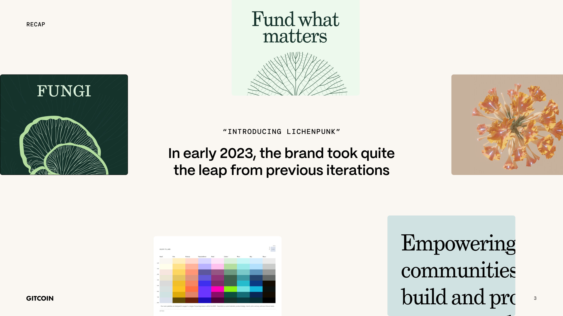
In early 2023 we introduced updates to the Gitcoin brand which reflected a move to more explicit nature-inspired themes, marking our ‘Lichenpunk revolution’—the incorporation of a broad color palette, nature-themed 3D graphics, and a visible-grid system which provided our design team with the tools to be both expressive and disciplined.
Though the feedback we received after launching that brand has been very positive, we’ve also spotted areas for further improvement. Our content was sometimes too dense and difficult to read easily, the color palette too broad for just one brand, and while our look captured our transitional phase, it didn’t quite point to our tech-centered future. Plus, the complexity made it tougher for folks who aren’t designers to use our branding tools effectively.
Streamlining for Clarity
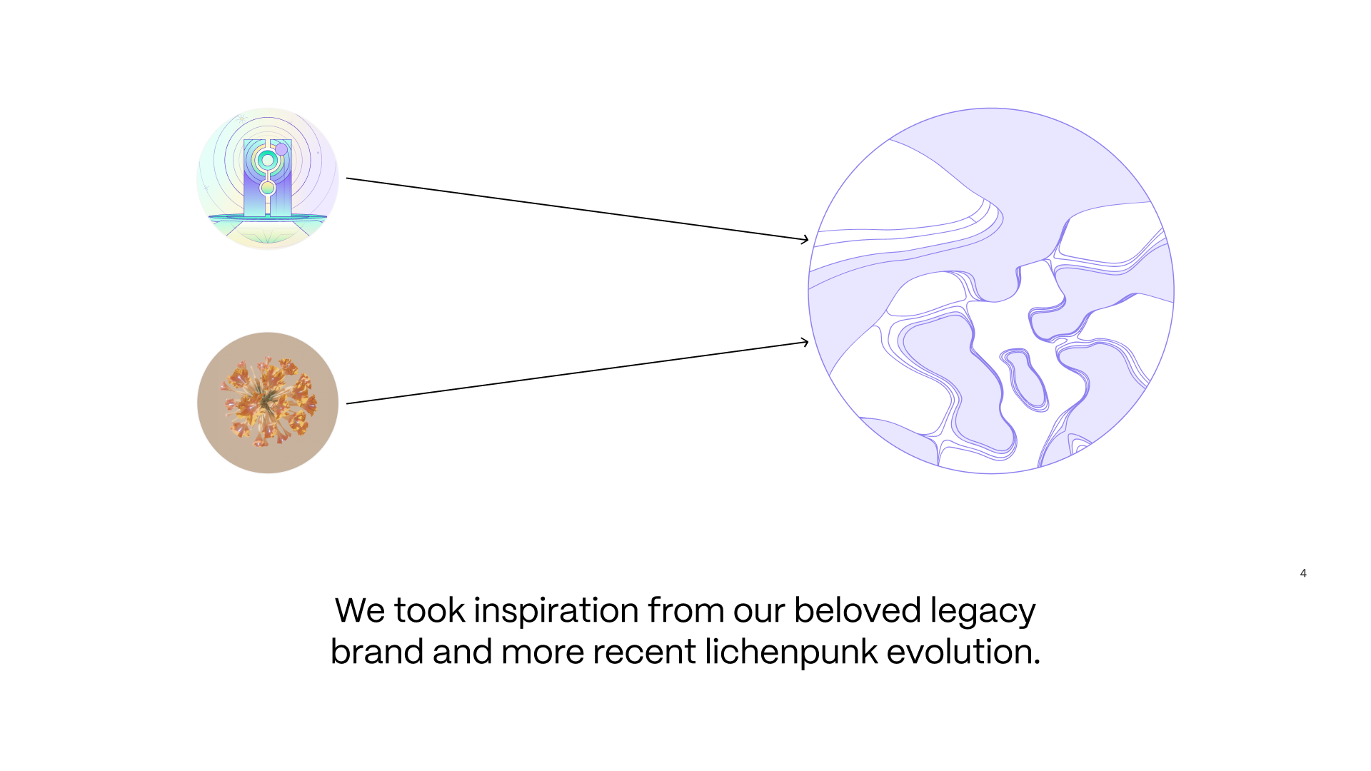
In reimagining Gitcoin as a product-first organization, we’ve made some key changes to reflect this. We’re blending the best of our past designs with an eye on the future. Our color palette is now more refined and intentional, and we’re using white space generously to make designs clearer and easier to grasp at a glance.
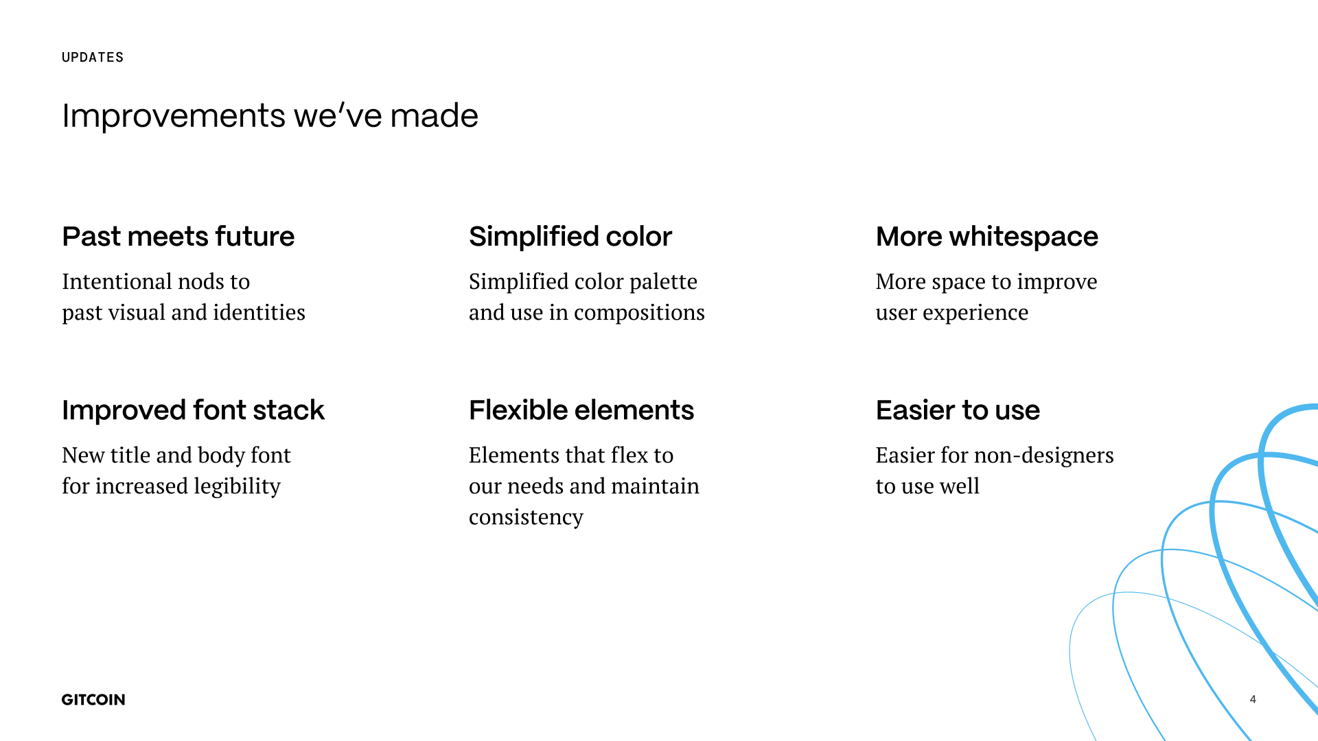
We’re not making any changes to our logo, and while we still love and will continue to use nature-related visuals, we’re going for a subtler, less literal approach. Our colors are dialed back to the essentials, sticking close to our original vibe but more structure in how we apply colors to layouts, illustrations and other assets.
We’ve flipped our fonts, opting for a modern sans-serif for headings and a readable serif for body text. This new combo aligns perfectly with our logo and improves legibility across the board.
Visuals That Speak Gitcoin
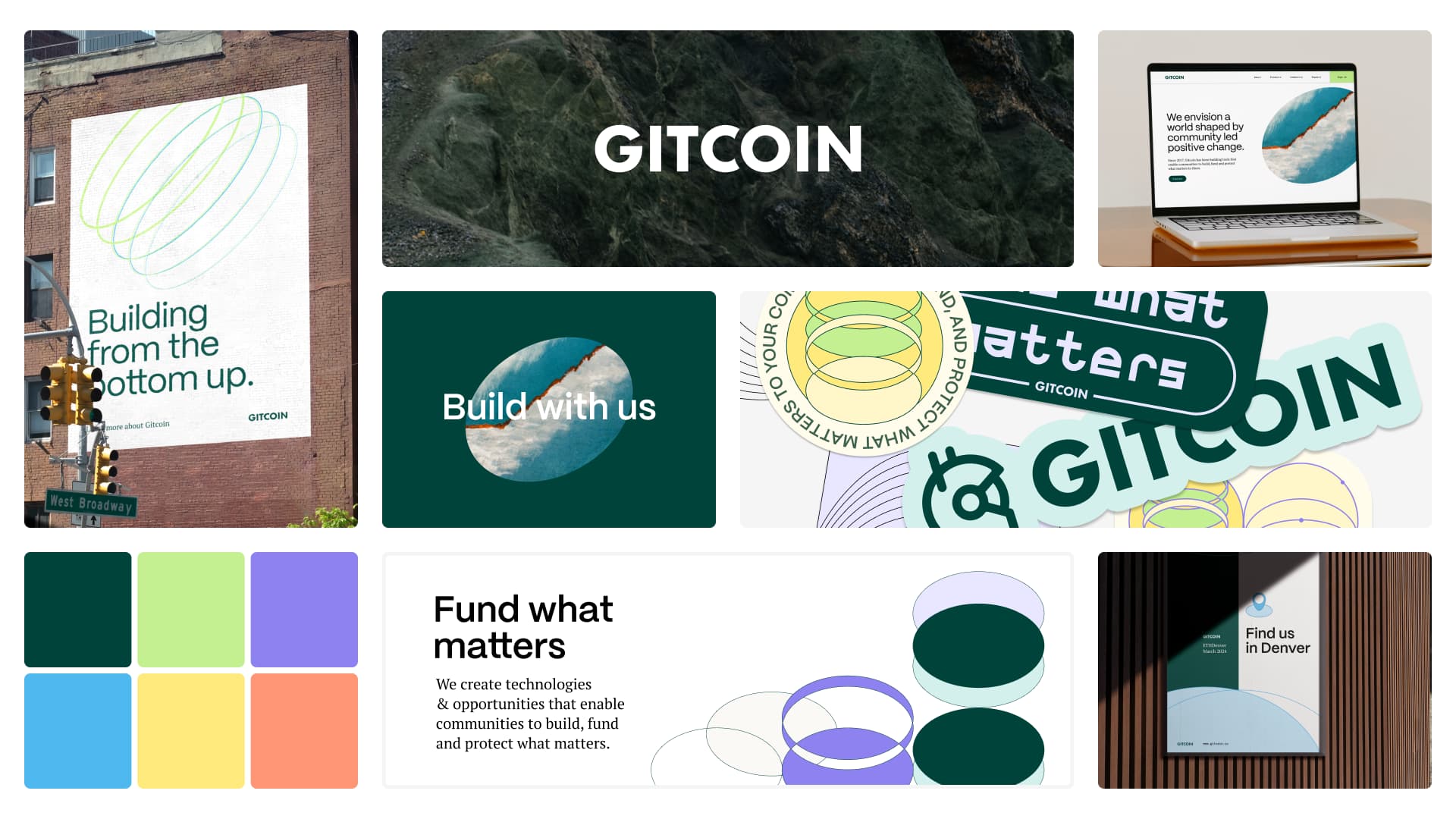
We’re evolving our visuals to be less literal about nature, instead going for shapes and forms that feel organic. This new direction spans 2D and 3D, tying back to our core identity in a simpler, more organic way. It’s about keeping things intuitive and connected, whether that’s through icons or broader design applications.
Wrapping Up
This isn’t just a new coat of paint. It’s a strategic step towards a brand that better aligns with who we are and where we’re headed. Your support means everything, and I can’t wait to see how these changes help us create a stronger community around Gitcoin.
Thank you to all of the amazing design team for driving these updates forward: LH, Cici and Gina, plus Alexa and Laura for continuous guidance and feedback throughout <3
I’m here for any thoughts or questions you might have
Links & Assets
View the full Brand Presentation (a more visual version of this post)
View the Gitcoin Brand Book
Access Canva assets!