[Discussion Series] Visually Adapting Gitcoin's Brand: Logo

This is the fifth topic in a series on Gitcoin’s evolving brand. Our visual brand identity is evolving as part of a larger reflection of our transition from an Impact DAO to a Protocol DAO, which we’re announcing at ETHDenver.

Process
As a values-led design team, we’ve been working to mindfully create concepts and ideas that are meaningful. This work is rooted in our Brand Values, and evolved in parallel with the brand strategy. For a refresh on the preceding work, watch our December Community Call and follow along with our presentation.

Outcome
Our design team has been producing visual assets and ideas to support the brand strategy that many of you contributed to and led by Alexa Lombardo. The design work being shared today is one part of a brand evolution process. The work is designed to shine a light on the larger function of Gitcoin, as well as reflect light on you as a contributor or community member.
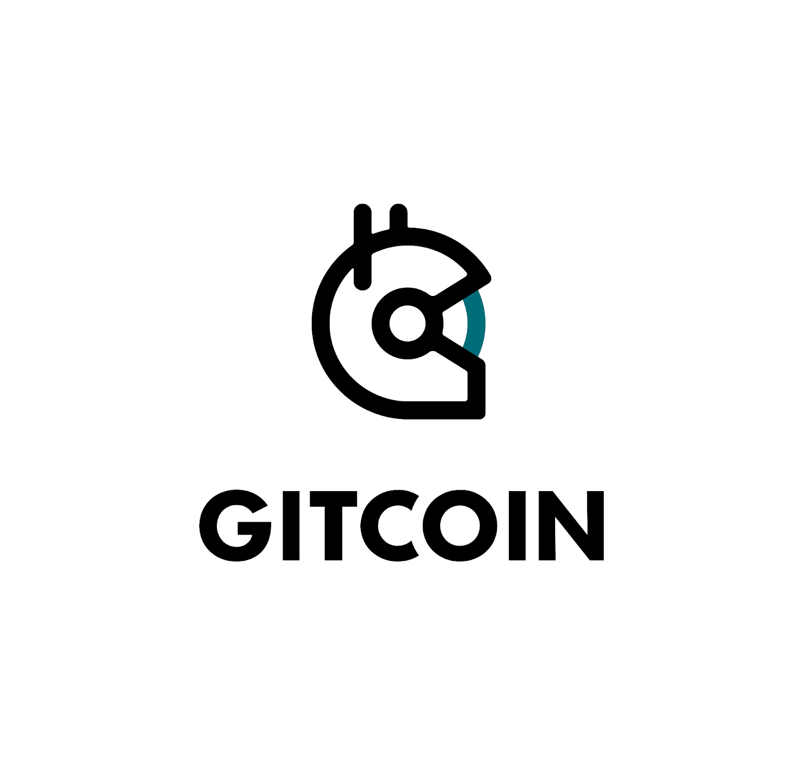

Current Logo


The current Gitcoin logo is our beloved astronaut helmet icon paired with Futura. The wordmark itself has nice letterspacing designed by Octavian, and he cleaned up the helmet icon as well. The original helmet design is an artifact from a less structured, more anonymous time in the dao’s history. We don’t actually know who made it…we do know that Gitcoiners love it.

Futura is an interesting choice for the wordmark because it’s a font that is classic, timeless, and always looks good with the right kerning. This typeface weaves in and out of fashion every ten years or so. A few years from now, you’ll see Futura everywhere again. The last time I remember Futura being so popular is when it became a web font in the early 2010s. Suddenly Futura was everywhere on the web, including whatever websites I was making at that time. :innocent:

I digress.

Logo process

After some initial exploration, periods of rest on this creative subject, and later conversations with thought partners, we landed on a logo refresh that feels less like a redesign and more in line with our theme of brand evolution.

Logo Evolution

Wordmark

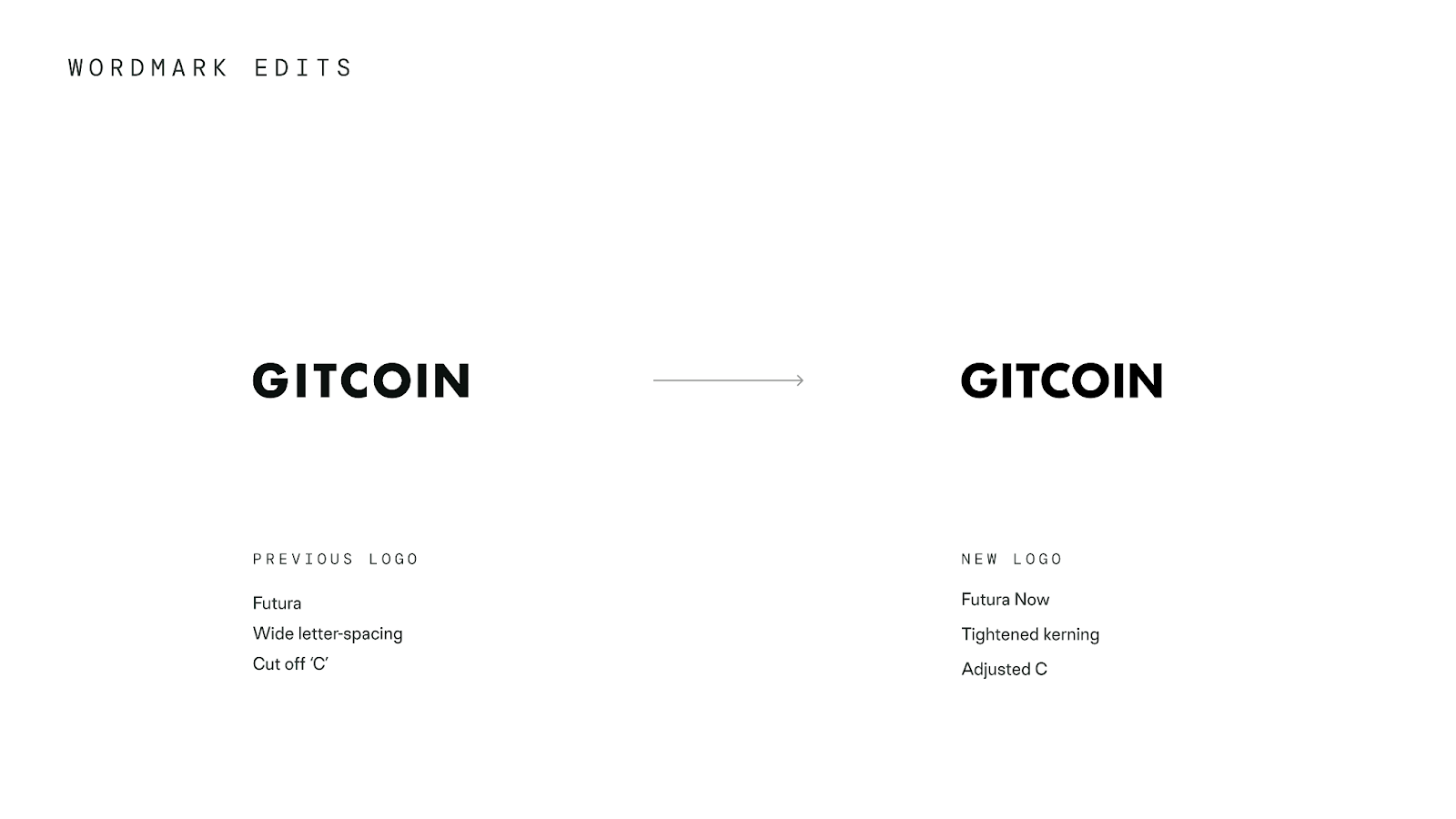
Futura becomes Futura Now, a modern refresh of the iconic typeface by Monotype. The kerning, or space between letters, is tighter which contributes to a feeling of healthy closeness between the letterforms, particularly the C and the O. The shape and proximity of the letterforms lends itself to the concepts of connection and communal vision we’re exploring as a dao.
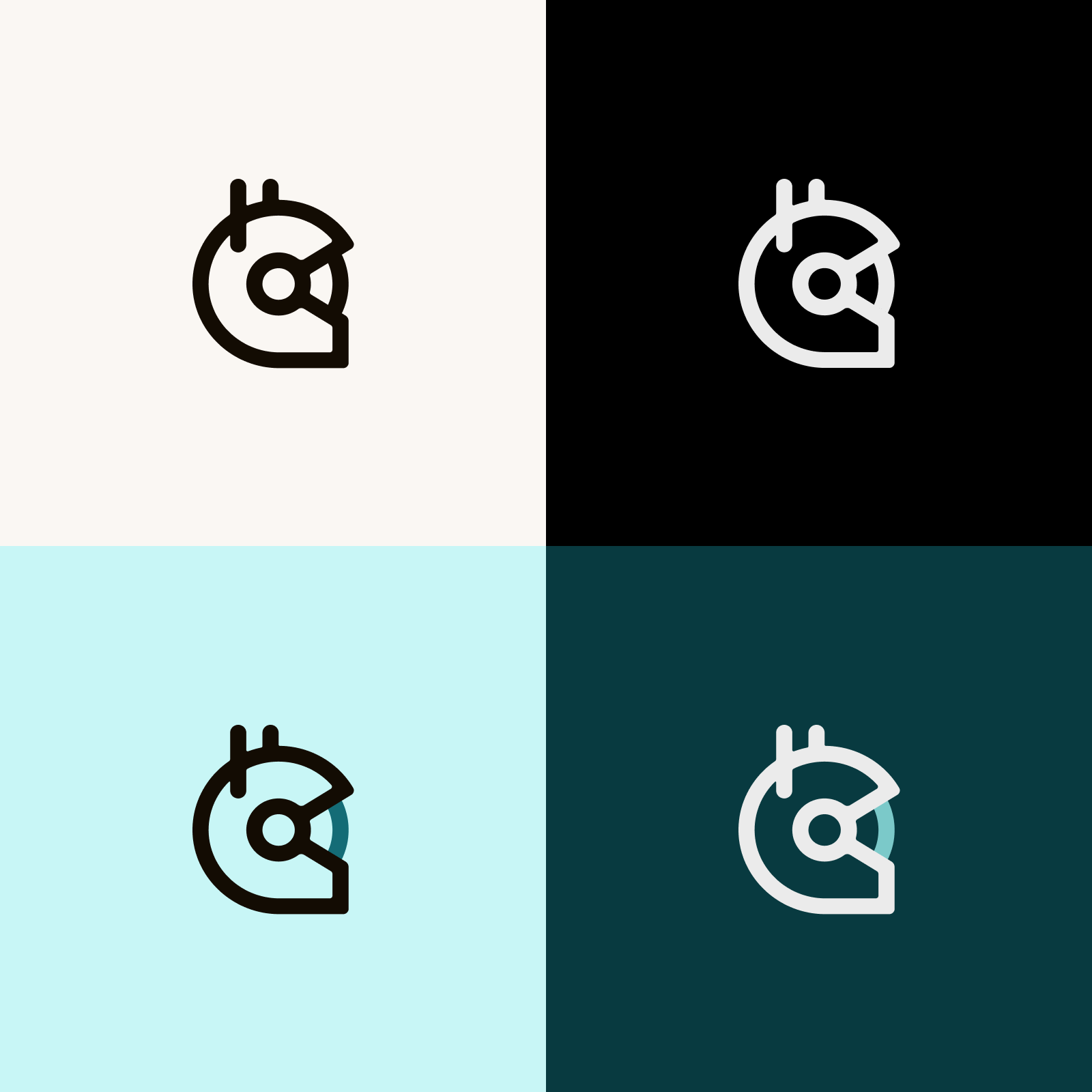
Helmet

It’s worth noting that the dark teal visor color is now accessible on light backgrounds, where the previous Gitcoin teal did not meet accessibility standards for color contrast.

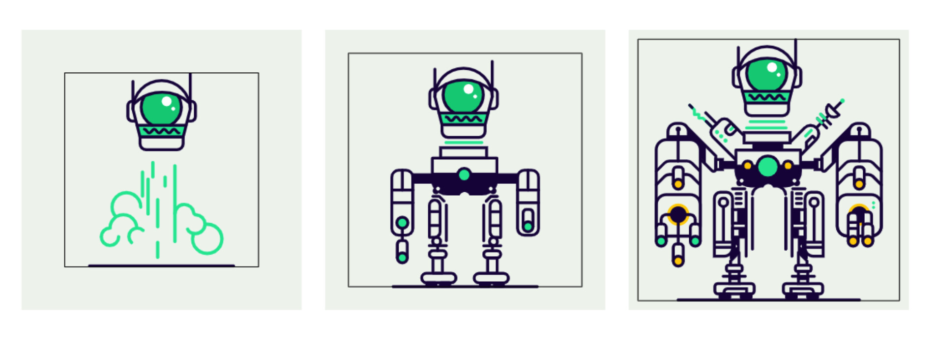
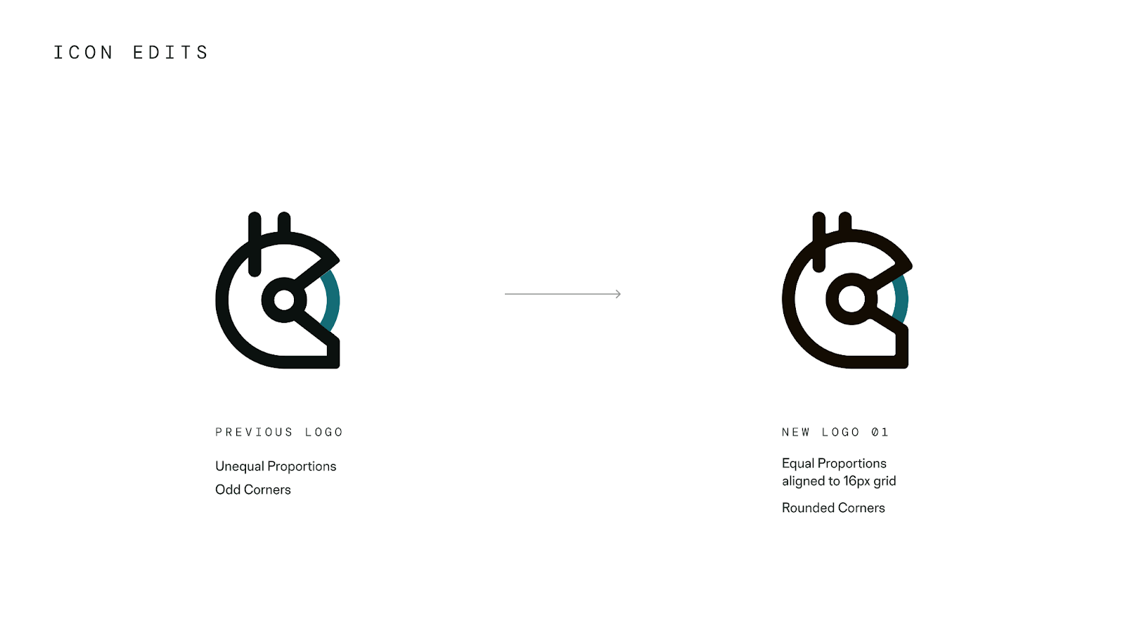
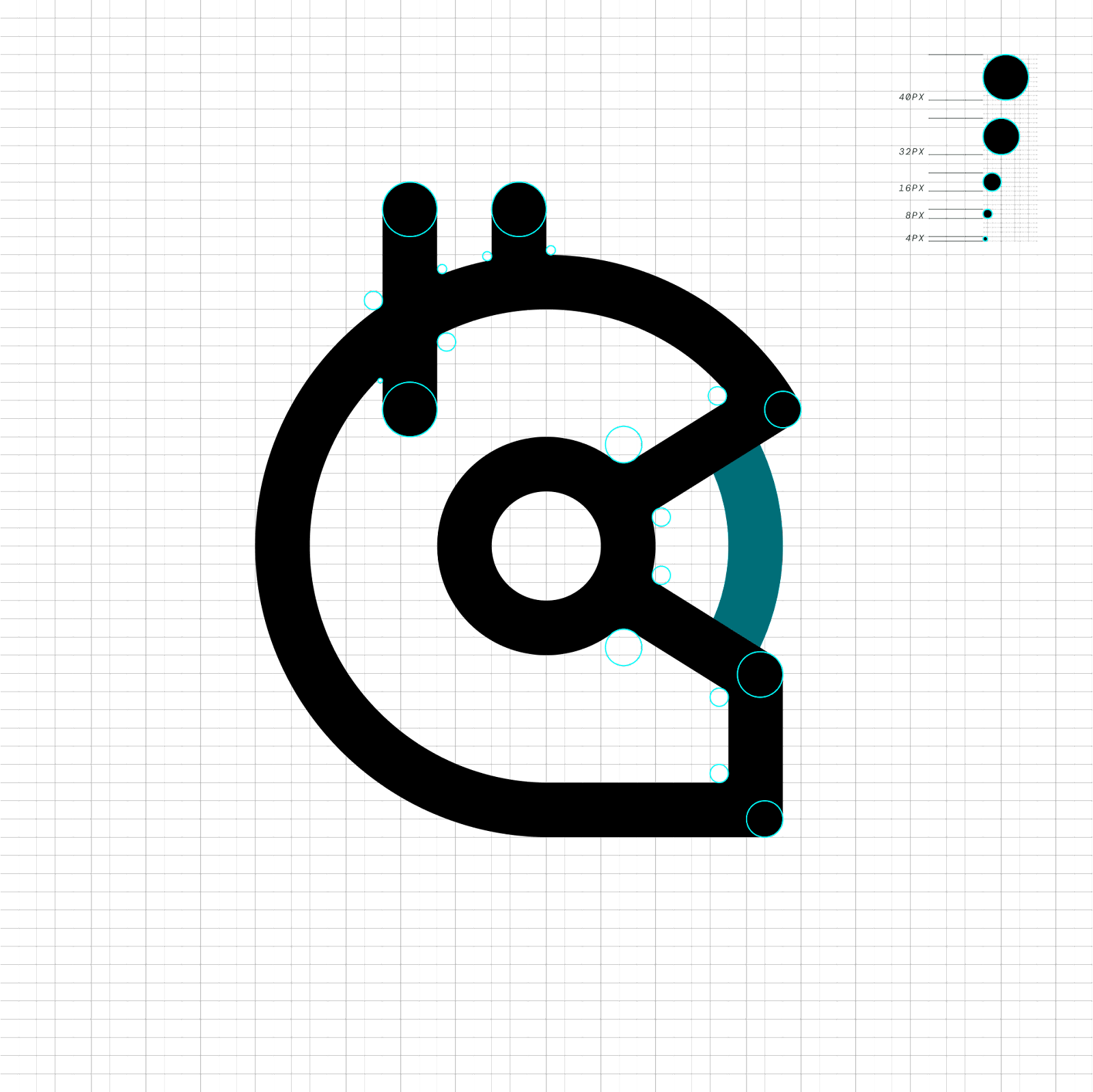
There are aspects to the original helmet construction that are off balance. When you adjust any part of the shape to make it right in your eyes (a subjective endeavour), a different piece of the helmet is suddenly wrong. A space helmet that looks so simple is actually pretty complicated.

The helmet is an enigma.

I love that about it.

New helmet, new era

Our designer Harry Eastham thoughtfully poured energy into adjusting the helmet to be softer, rounder, more proportional, adjusting the angles in a way that aligns with Eduardo’s forty-five degree angle suggestions, and generally considering the details.

Logo system

Our logo guidelines

Simplifying and clarifying our brand logos with concise guidelines. Please note that the following are marketing guidelines. Separate considerations are being made for our product UIs, specifically the use of the helmet logo in our navigation headers. Context is key!

For our logo, the wordmark is supreme. Our wordmark is clean, simple and distinctive. It’s new and feels familiar. The characters and letterspacing invite a new view of our legacy logo. The wordmark will essentially be used everywhere that the full (helmet+wordmark) logotype is used today. Think website headers, product headers, merch, content marketing, slide presentations, and work that is seen on a daily basis.


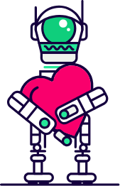
The helmet is a standalone detail or a feature. Let’s preserve the magic and protect it from overuse by showing it less often and more intentionally. Example places to use the helmet include web footers, social media, memes, special edition pins and merch.


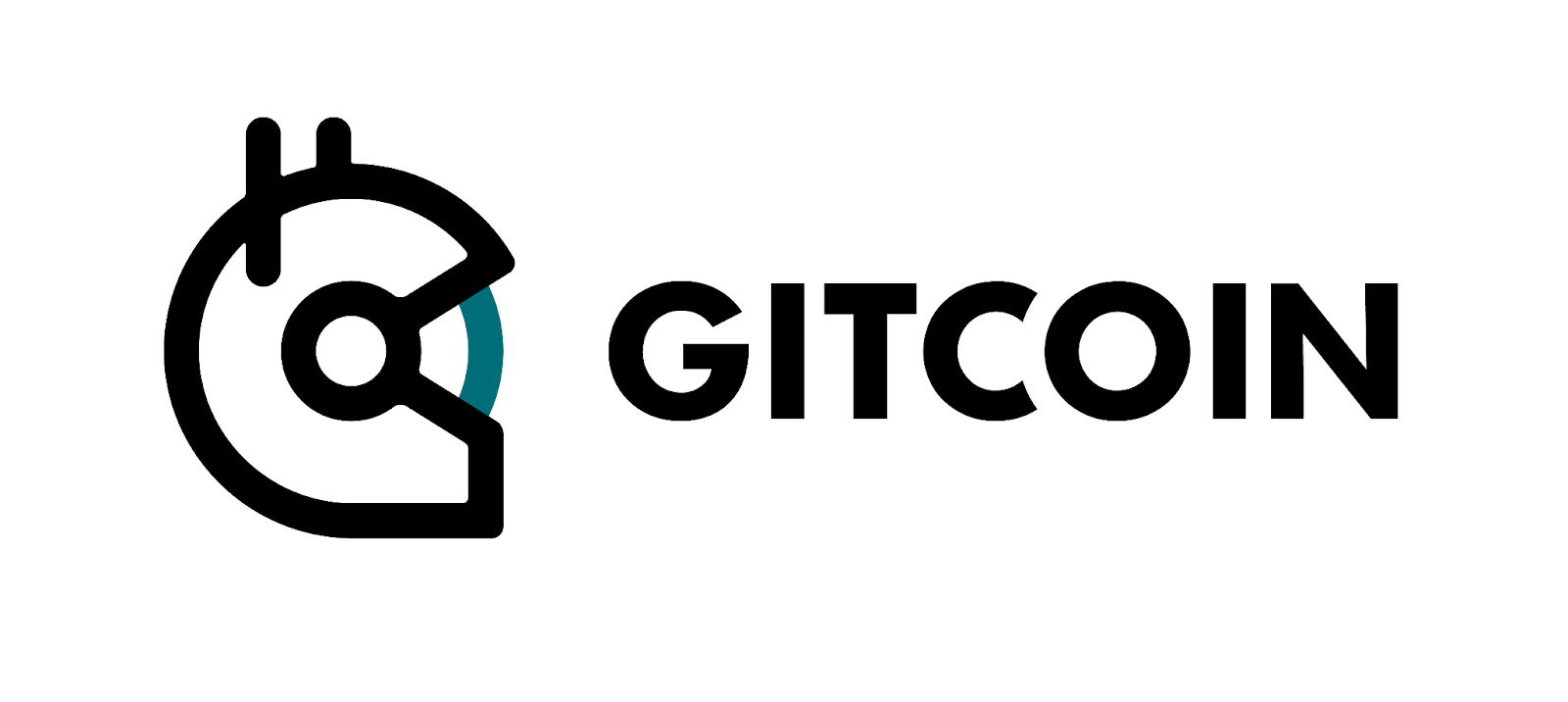
Our combined logo - helmet and wordmark - is available for use when needed.

The combined logo options are available for places where the wordmark might be less capable of standing out on its own. One example is a poster or presentation slide with many different logos from industry partners or peers all displayed together.

Thank you

logotype
Animation sketch from Harry


Please ask clarifying questions or leave feedback in the comments.

Pro tip: When giving feedback, aim to be as objective as possible. Explore where your thinking originates. Does your point of view connect to the brand strategy? Is your perspective connected to our values? How so?

Our next post will be about PHOTOGRAPHY.

7 Likes

Love this! Excited for the photography post :slight_smile:

4 Likes

Loving all the thought that goes into this. Thank you design team!

4 Likes

Great post!

I just wanted to add some some historical context on the original intent behind making the logo a helmet.

The idea was that the helmet protects you (and enhances your abilities) as you enter the wild/new frontier of web3. It helps give you the confidence to leave behind the dry bland corporate or uni world and enter a pluralistic frontier where many new things are possible.

If you watch this video (the og launch video for Gitcoin) you will see the transition at the 0:24 mark.

The inspiration for the transition was the transition for Dorothy in wizard of oz from her bland world in Kansas to the wonderful world of Oz.

Anyway. Thats the history!

3 Likes

Oh and one last note about the helmet. I forgot to add these historical details too.

The idea was that the helmet grows => robot => superpowered robot. And that would be a metaphor for people becoming competent at surviving / thriving in the new frontier.

When Gitcoin Grants launched we ended up transitioning more primarily to a robot learning to love.

heart-robot

:robot::heart:

The idea was that there is a contrast between the cold mechanistic immiutability of blockchains + the type of culture/love for public goods/humanity that we want to use those cold tools for. By embracing/celebrating this contrasts, and teaching our robots to love, we enable our mission (then Grow Open Source… but now I think the purpose is “build/fund public goods” or "fund what matters)…

As pluralism became a value we embraced (and Gitcoin Kudos launched), we enabled the community to evolve this robot vision in their own directions via bounties…

A repo of these bots exists here.

Anyway… I’ll embrace whatever yall wanna do with the helmet/bots in the future… But thats the history of why helmets/bots.

4 Likes

Ah, this is cool! Thank you for sharing. I never heard the Wizard of Oz aspect before. Happy for the astronaut to be demystified here, I always understood a general sense of exploration with it.

Can you imagine how the fresh helmet will look as a metallic pin?! I want this piece of the brand to have new opportunities to shine. We’re designing some really good motion styles for it too. :smiley:

Part of our inspiration was actual space suit refreshes that are designed for multiple destinations: https://www.nasa.gov/feature/a-next-generation-spacesuit-for-the-artemis-generation-of-astronauts

2 Likes

Funny story - When I was creating and stewarding the brand, it was nearly all about bots. Later the bots transformed into astronauts around 2020/2021. I’m not sure why or how that transition was made. I always thought that astronauts were a bit cliche (everyone in web3 uses space/astronauts in their imagery, its part of the “to the moon!” moonboi culture of crypto) but I went along with it because the designs were cool and the metaphor of going to space and trying to inhabit an inhabitable environment there is also a metaphor for doing hard things like funding public goods (going to the Quadratic Lands)!

Though thinking back on the launch video, I suppose the visual image of the person putting on the helmet looks kind of astronaut-ey in retrospect. The idea behind doing that was using computers to augment our abilities and give us superpowers to explore new frontiers. But the launch video wasnt set in space so :person_shrugging:

Anyway. I support 100% whatever the brand stewards want to do. Just adding more context because I :robot: :heart: the Gitcoin brand.

Cool idea!

1 Like

This is really helpful because a lot of what we’re doing is helping to ground the brand a bit, since we’re not trying to colonize mars or anything like that. Love the spirit of exploration, so we’ve been aiming to evolve that energy with visuals that keep us tethered to earth.

I can relate to this, lol.

Three things:

  1. I’m working on separate documentation of our design ethos, and the introduction charts our path of growth from early days (bots → robots) to now. This is going to be so helpful in filling out a couple lorem ipsum slides - I think intuitively I knew we’d figure out the details and now the story has been gifted to us in this thread. Thank you!
  2. This is giving me a lot to think about for metaphors. Instinctively my pitch is that a robots learning to love story is more powerful for community lore than tethering it to our brand identity.
  3. Thank you for the brand support!!! Building this in public is really opening my eyes to how radical decentralizing design can be. We’re working in a hybrid model that allows for consistency with contributors and…I’m so grateful. :woman_astronaut: :two_hearts:
2 Likes

I think that rewriting the laws of economics to favor the commons/public goods/solving coordination failure is as profound and hard as trying to colonize mars. (though it’s not one thats permeated as many hearts/minds because we lack the visceral “person on the moon :woman_astronaut::us::full_moon:” moment in our collective memory, at least so far)

This vision of rewriting the laws of economics to favor the commons/public goods/solving coordination failure, was the statement of where Gitcoin was going when I was involved, perhaps best expressed in Quadratic Lands launch video. I have no idea if thats the current direction though and defer to Gitcoin on it’s current direction.

Networked organizations and networked movements are so interesting because if you hold space, build common knowledge, accept contributions from anywhere, and have a purpose that people want to support, you’ll be surprised in what you receive back by building in public! A lot of inspiration for this comes from this Impact Networks post

1 Like

Really excited by this evolution - and feel the use of the wordmark solo, without logomark, leaves room for us to think about what the logomark really means to us, the community and the brand, but also how these visual expressions tie to our product evolution.

Also really appreciate this additional context. The helmets - and their history - are and always will be important. same case for the evolution of the narrative you explained @owocki - and also agree with your point about lore @birdsoar

I’d love to see us complement these historical visuals/icons with something emblematic of where we’re going and the actual tools we’re creating. The robots, astronauts, love are all great. But our products have also evolved - we’re building protocols for funding mechanisms and sybil defense plus a stack of apps that make running grants programs easier and foster more community led funding opportunities. Yes, all of this contributes to the journey into a new economic order, a new world, the quadratic lands - but there is also a wealth here and now for us to communicate about those products before we’ve even gotten to that new place.

Based on this brand expansion work, lot the evolved visuals that are emerging will help us tie to the two together, which I’m very excited about. Looking forward to seeing how we weave in new illustrations that connect our past, present and future to our products and our vision.

4 Likes