[Discussion Series] Visually Adapting Gitcoin’s Brand: Illustration
Co-authors: Biux, Laura Helen
This is the seventh topic in a series on Gitcoin’s evolving brand. Our visual brand identity is evolving as part of a larger reflection of our transition from an Impact DAO to a Protocol DAO, which we’re announcing at ETHDenver.
Decentralized design is a living, breathing public good.
Sharing our visual brand design progress publicly is a milestone in translating the work from figma files to our community. The purpose of this post is to illuminate the meaning of our team’s work, inspire your own, and spark questions. This post is opening a channel for our design team to connect with you, our community and peers.
Process
As a values-led design team, we’ve been working to mindfully create concepts and ideas that are meaningful. This work is rooted in our Brand Values, and evolved in parallel with the brand strategy. For a refresh on the preceding work, watch our December Community Call and [follow along with our presentation (Gitcoin Community Call Brand Takeover - Google Slides).
Outcome
Our design team has been producing visual assets and ideas to support the brand strategy that many of you contributed to in efforts led by Alexa Lombardo. The design work being shared today is one part of a brand evolution process. The work is designed to shine a light on the larger function of Gitcoin, as well as reflect light on you as a contributor or community member.
Illustration
Illustration has long been a part of Gitcoin’s beloved brand.
The intent of our decentralized documentation is to welcome any illustrator into the brand as it evolves, and share guardrails to shape their style. Our illustrator Biux is setting the tone for a range of illustration styles to meet the new Gitcoin era where it is.
Blending Styles
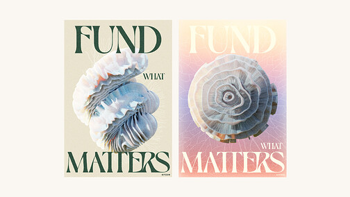
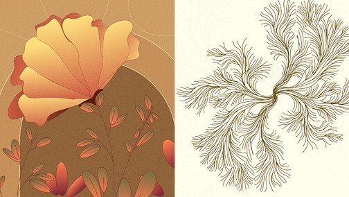
Our evolving style is a blend of 2d and 3d shapes that blend and mesh into intricate, inspiring designs that carry forth a sense of motion.
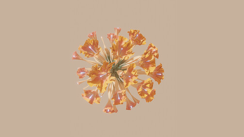
3D Blooms
Blooms can be used to explore the mesmerizing variety of organic structures and natural patterns, with tessellations, and logarithmic spiral shapes. We’re taking a biomorphic design approach to living forms as a starting point for our visual exploration.
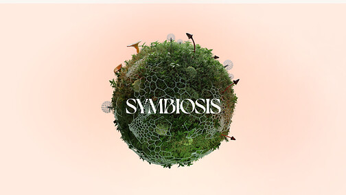
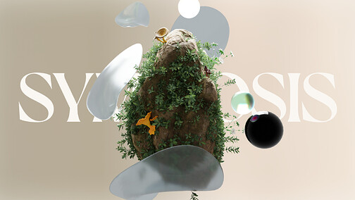
3D Symbiosis
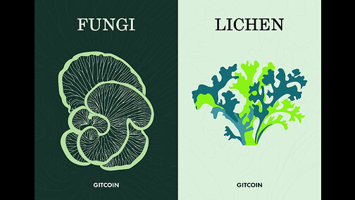
Inspired by natural ecosystems, influenced by local native tree species and their accompanying vegetation, fungi, lichen & moss.
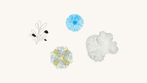
Line & Weight
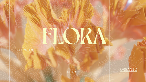
Our work can be communicated with minimal, intricate geometry and naturally occurring networks, organic construction (think the gills of a mushroom) and invisible routes. Line weights can vary slightly, depending on the shape and context. Line style, too, can vary according to the desired outcome.
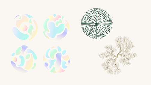
Shape & Texture
Circular shapes and freeform, loosely structured organic shapes can create a sense of harmony and differentiation that is found in natural forms. When gradients are applied to smoother surfaces, they become a textural and a subtler form of biomimicry, like the prismatic shine one might find inside a seashell.
We’re working on more facets of the brand with illustration, including people, and can’t wait to show you when it’s ready.
Thank you
Please ask clarifying questions or leave feedback in the comments.
Pro tip: When giving feedback, aim to be as objective as possible. Explore where your thinking originates. Does your point of view connect to the brand strategy? Is your perspective connected to our values? How so?
Our upcoming post is on decentralized design documentation as a public good, and will be the last of this series.
