Over the years I have been publishing graph visualizations of the Gitcoin Grants datasets, like these.
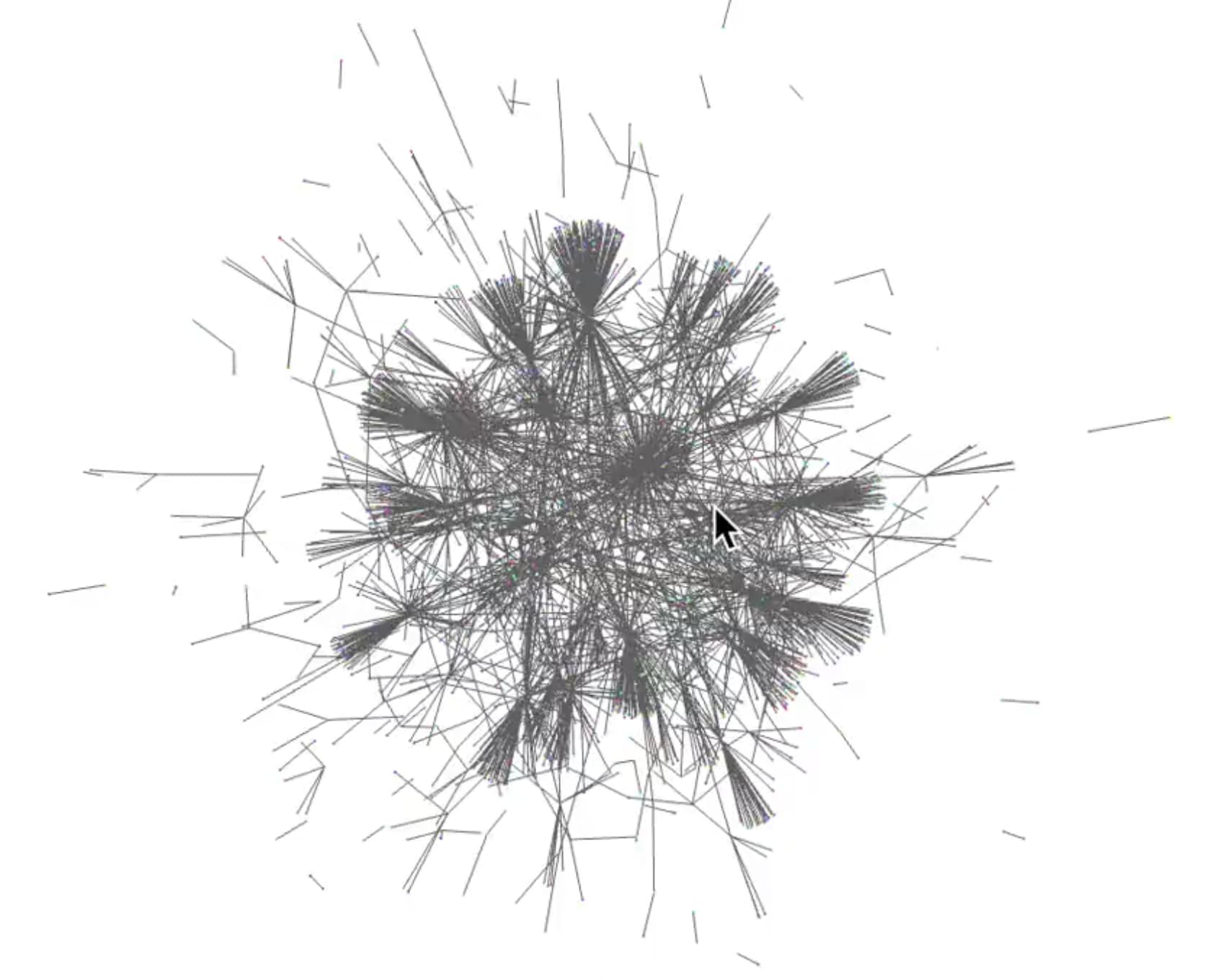
This is data from Grants Round 13. Each node in the network is a user (or grant) and each edge is a transaction between those nodes.
I find these graphs are useful for visualizing each grants round in 3-dimensional space. Using this data you can see which users/grants are hyperconnectors and which are on islands unto themselves.
@Benwest asked me to tell him how to generate mesh visualizations of the grant data., so here goes:
On Grants 1
- Get staff permissions on Grants 1 from CSDO.
- Go to
https://gitcoin.co/_administration/mesh - Enter the fields on the form, and click ‘Go’.
- This doesnt ALWAYS work because sometimes there is so much data the tool times out (either server side, or client side it can crash your browser). If this happens, try again and use the ‘trimmed’ parameter to trim the dataset by 99%.
Here is what the form looks like. The fields:
- Trimmed, 0% to 99% how much should the data be trimmed into a representative sample? (default: 0%)
- Label: Do you want to see the names of the nodes? (default: no)
- Theme: light or dark, self explanatory (default: light)
- type: return grant data, bounties data, tip data, kudos data, or all data (default: all data)
- From/to: from => to dates (default: current day)
/results updates
Every round I’ve historically tweeted out these onto this thread and updating https://gitcoin.co/results/ with the new viz here
Now that I’m disaffilated I wont be doing this for GR15 data. Someone in the DAO should probably do it IFF it the DAOs intent to keep publishing these.
On Grants 2
If anyone wishes to build a similar tool for traversing the data in Grants 2, you can just use simplegraph.js to do it. Just plug in the transactional data to that visualization tool.
There are probably better graph analysis tools to use, but simplegraph.js is the one i’ve used.