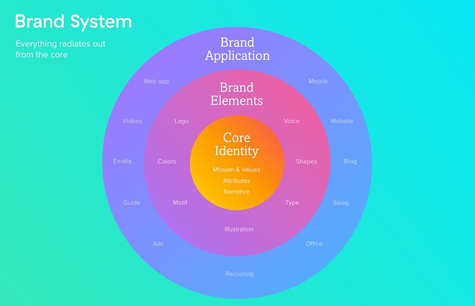
Does our current visual identity align with the values of the DAO?
The organizational identity of Gitcoin is changing - given the language and championing around the regen movement, it’s clear that a renewed focus on impact is emerging.
Are we signaling our commitment to being a forward-thinking impact-driven organization through our visual representation, the visual assets we use, our brand aesthetic?
Is there room to broaden the visual identity of Gitcoin as a new overall brand identity (i.e., values, focus, vision) emerges?
Moreover, in the past months, we have seen inconsistency in Gitcoin’s external-facing branding. How we represent our products is incongruent. For example, the way we visually represent grants rounds and the graphics that we use to promote events is completely different.
In MMM’s work to update the brand guide, we have reached a point where we now have questions on what next steps to take in how we represent ourselves as an org. Naturally, we think that this should be a discussion through the community.
This leaves us with the question:
How can we create a visual brand that is streamlined and cohesive?
We believe it is important for Gitcoin to consider this question as we work to be industry leaders and galvanizers in Web3.
Our shared mission, our org culture, our voice, is best signaled with a consistent aesthetic. Our relationships to external stakeholders, our growth efforts, our organization’s focus (internal and external) will be supported by a consistent aesthetic.
In order to move this effort forward, we propose the creation of a brand council to meet and workshop on some of the following topics:
-Pulse check on current branding
-Emerging themes & brand alignment/expansion
-Creating and enforcing a point of truth for visual assets at Gitcoin
@Viriya & @seedphrase
MMM Workstream
